Boundary
2022 · B2C SaaS plus a box


The first step in the redesign process was to conduct user research to understandthe needs and preferences of our potential customers. This step was crucial as it helped us identify any potential issues and opportunities that we could address in the redesign. To gather this information, we employed a variety of research methods including competitor benchmarking, surveys, interviews, and focus groups.
For competitor benchmarking, we analysed the sales journeys of similar products in the market and identified areas where we could improve upon or set ourselves apart. Surveys and interviews allowed us to gather a larger sample size of feedback from potential customers, which helped us identify common patterns and themes. The focus groups were particularly valuable as they allowed us to observe users interacting with our early prototypes, which gave us a deeper understanding of their needs and preferences.
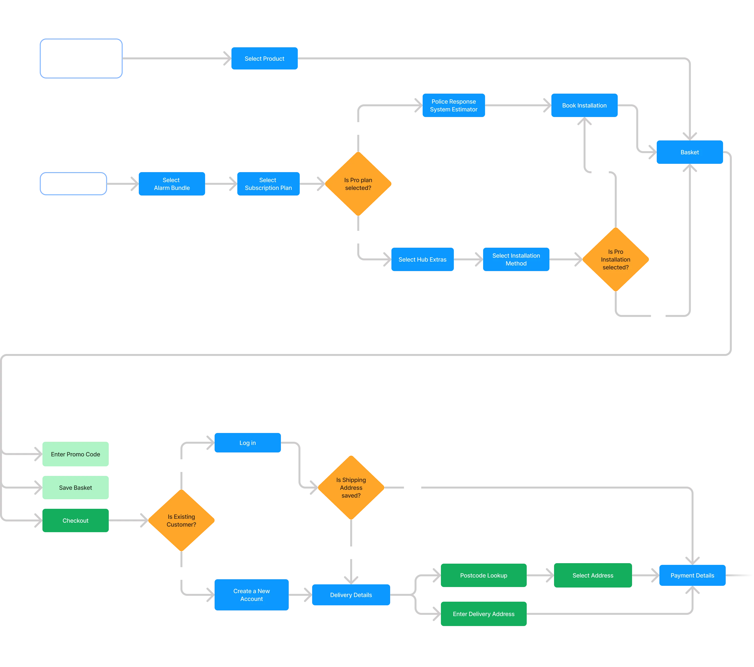
Once we had gathered and analysed all of our findings, I went back to the drawing board and utilised an iterative design approach to design a new solution. I conducted multiple user testing sessions and gradually refined my ideas based on participants' feedback and insights drawn from observing peoples’ behaviour while interacting with the prototype.
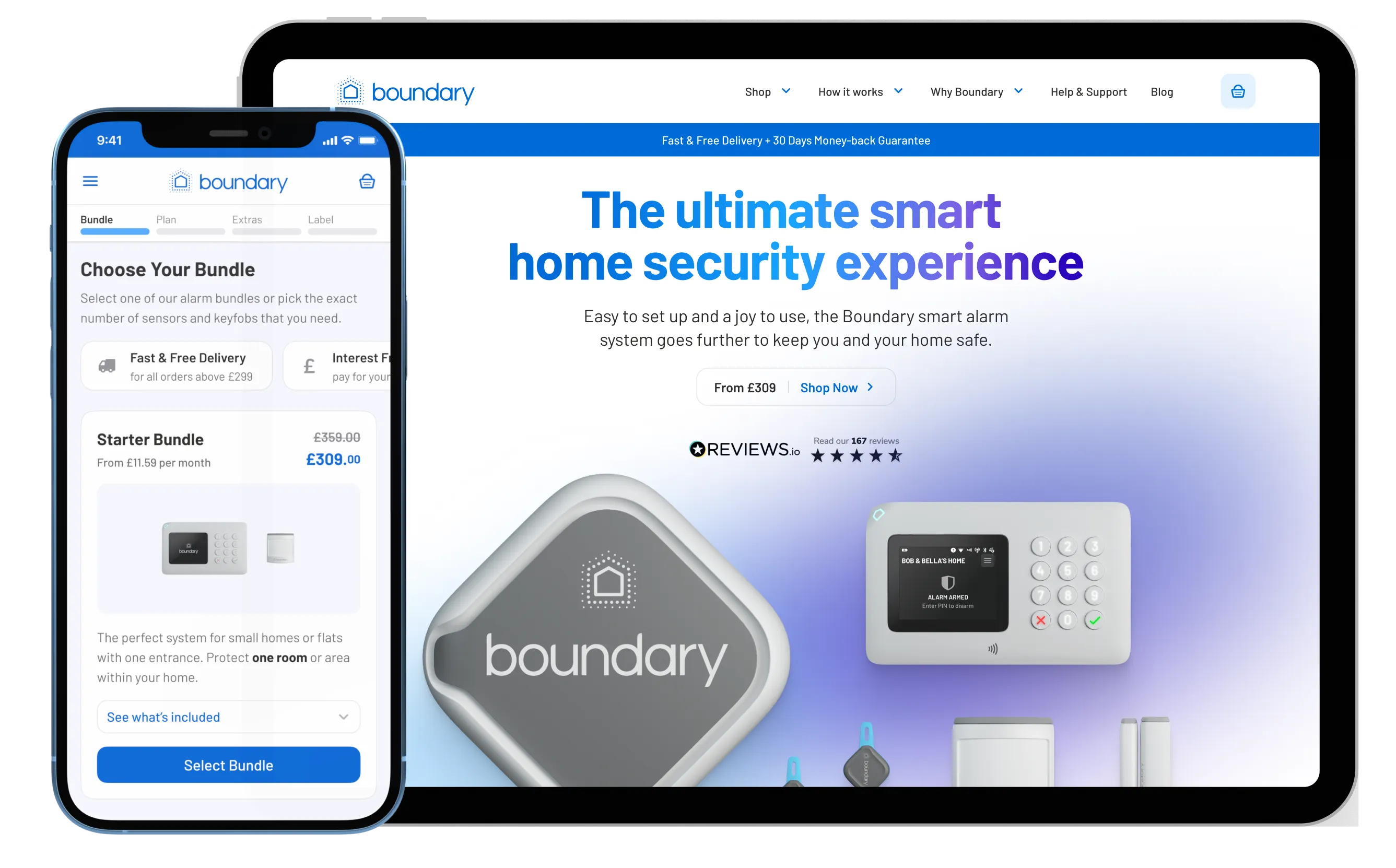
The final result is a step-by-step flow, utilising progressive disclosure of information that focuses customer’s attention on the most important details first. All while providing supplementary contextual information that is easily accessible when needed within the journey.
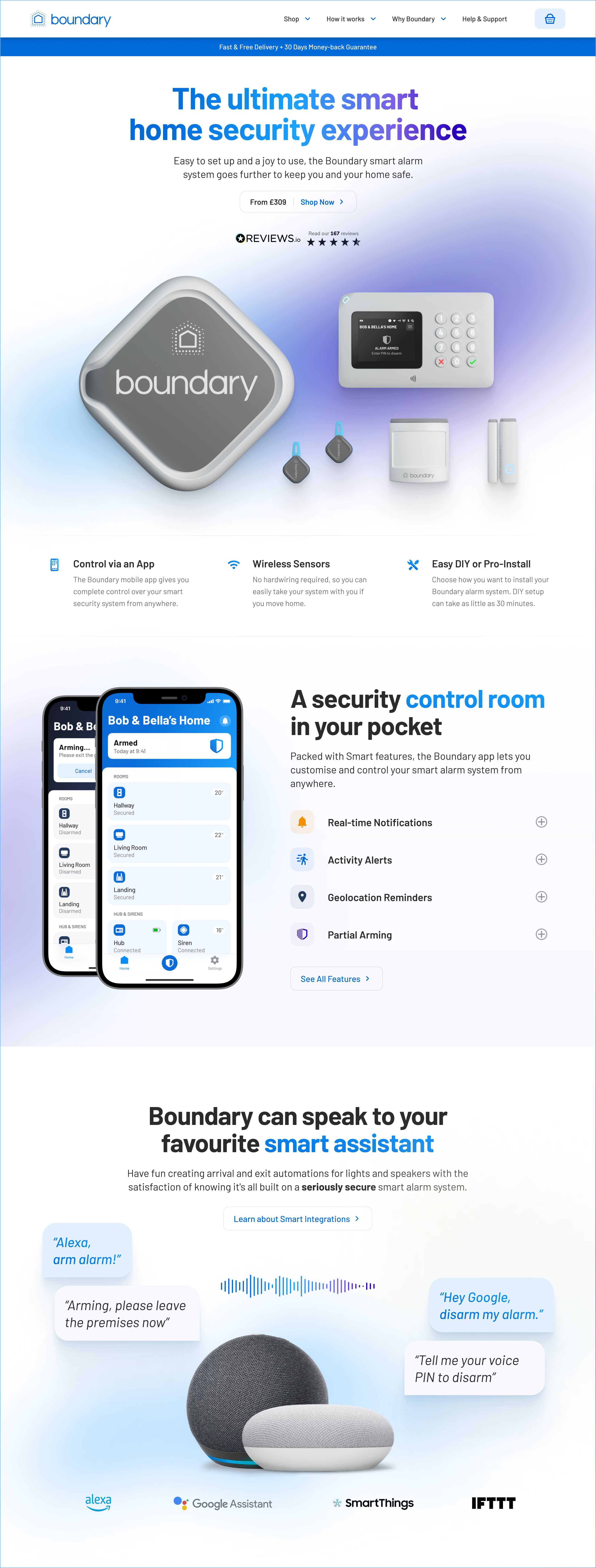
Another crucial task was to redesign Boundary's homepage and ensure that prospective customers had access to enough information to make an informed decision when comparing the product to competitors.
The above-the-fold area instantly communicates the nature of the product and its credibility. The core navigation is consistently featured in the header, making an effective logical combination of links and dropdowns, inviting visitors to learn more about the alarm system and enter the purchase funnel. The content on the page is concise and informative, utilising a solid typographic hierarchy that makes the web page scannable and allows potential customers quickly understand the value and benefits of the Boundary alarm system.