TableSense

2023 · WEB APP & LANDING PAGE
Image showcasing two devices with displays of a table booking system called 'TableSense.' On the left, a laptop screen shows the TableSense website homepage with the headline 'Unlock the Power of Effortless Table Booking' and subtext encouraging more time running the business and less time managing bookings by hand. There is a 'Get Started for Free' and 'Book a Demo' button available. On the right, a tablet displays a detailed calendar view of the TableSense platform with time slots and reservations for different tables for 'Thursday Jul 20 2023.'. The interface is designed for efficient management of restaurant bookings.

What's TableSense?

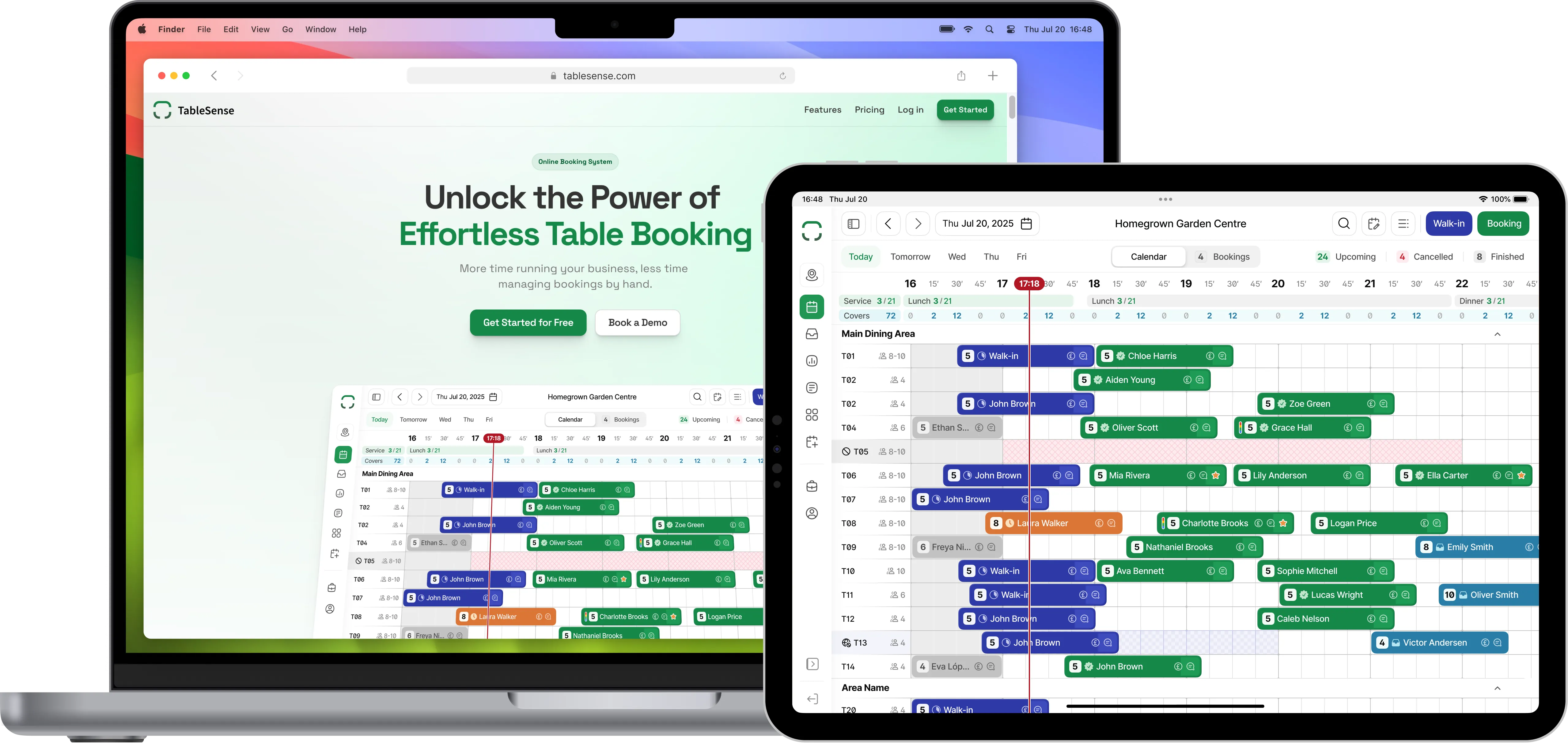
TableSense is a smart table booking system created specifically for the hospitality industry. With features that align with merchants' needs, the system provides options like online booking schedules, categorising booking zones, and the ability to impose charges for cancellations and no-shows, among others.

CONTEXT
The TableSense team reached out to me in late 2022 with a clear vision for their product. They had already made some rough mockups based on preliminary research. What was missing, however, was a unifying UX design and a fresh, cohesive look to bring the product to life.
MY ROLE
Product Strategy
Interaction Design
Visual Design
User Flows
Rapid Prototyping
User Testing
TOOLKIT
Figma logo Hotjar Logo
PLATFORMS
Safari Browser Icon

Research

We engaged in conversations with prospective clients, primarily targeting small to medium-sized restaurant owners. Utilizing a blend of individual interviews and limited focus groups, we sought to understand their necessities, anticipations, and interactions with existing online reservation systems, considering both their perspectives and those of their customers. Here are some of the key findings from those sessions:

1.
Clarity over Complexity
While merchants appreciate robust tools, they don't want to grapple with an intricate system.
2.
Platform Agnosticism
A system should be a convenience, not an obligation. Hence, multi-platform compatibility was non-negotiable.
3.
Seamless Integrations
Today, booking systems must seamlessly blend into digital spaces, be it through social media links or website widgets.
4.
Data-Driven Decisions
Merchants love a peek into booking trends. Real-time data lets them strategize - from managing inventory to planning staff rosters.

Goal

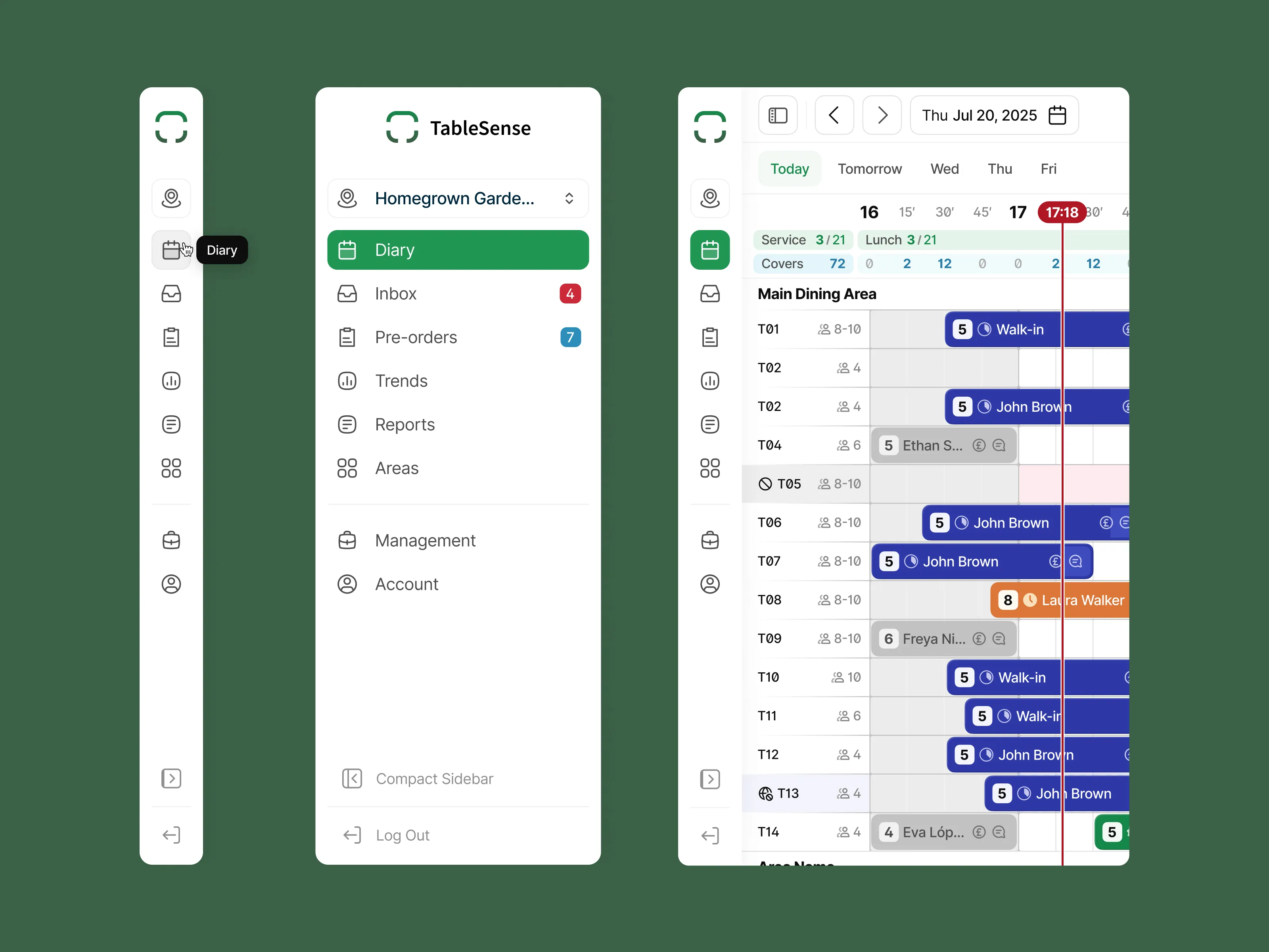
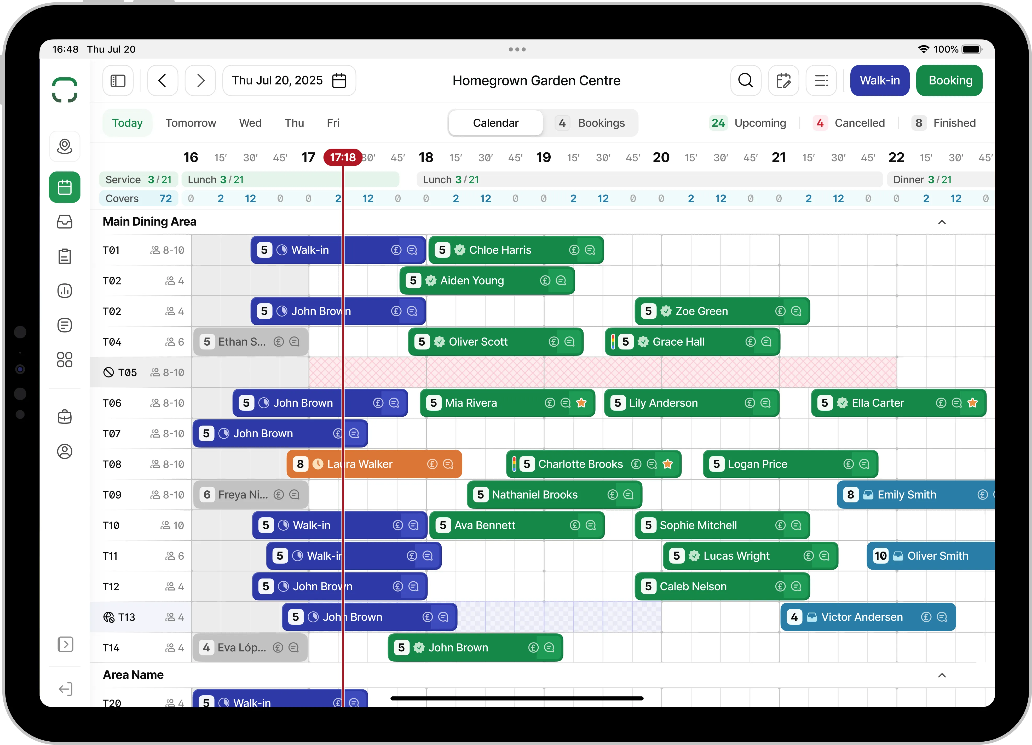
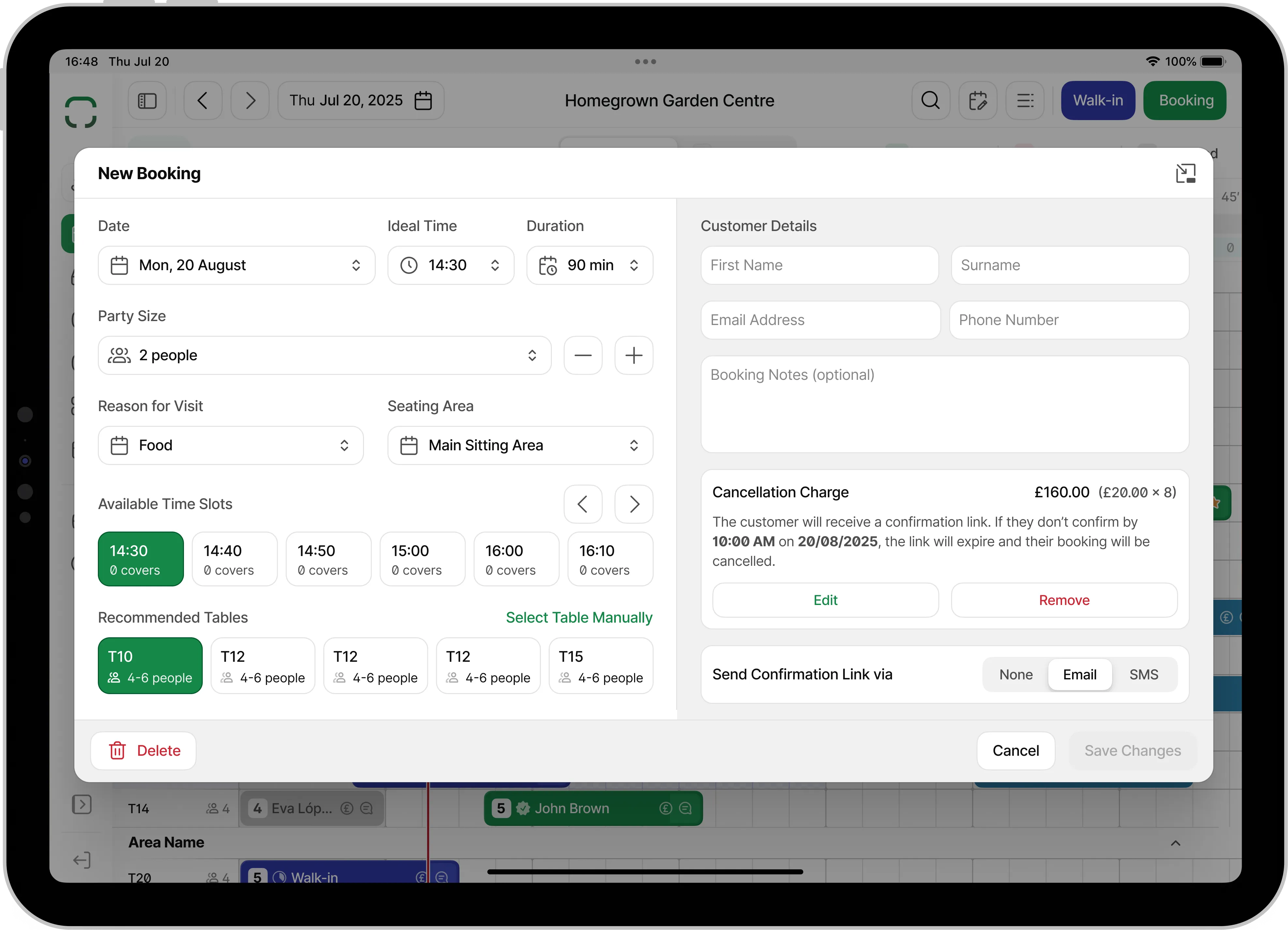
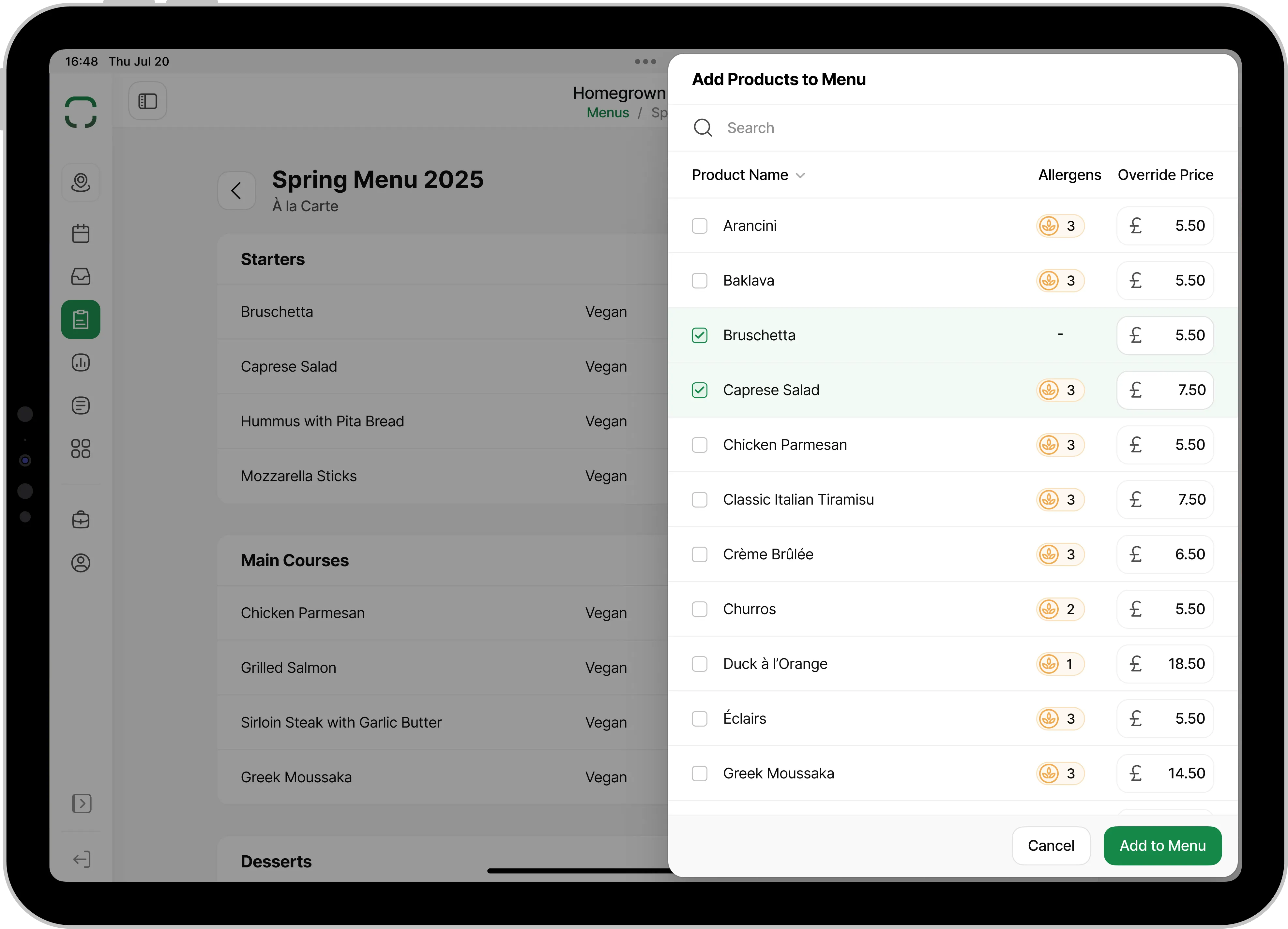
Our top priority was to develop a multi-platform product that effectively presents vast amounts of information in the diary view, ensuring a user-friendly interface that remains streamlined and responsive, especially on smaller screens, while prioritizing an intuitive and touch-friendly experience.

Image displaying a user interface for TableSense, a restaurant management system. The left side shows an expanded sidebar navigation menu with options like 'Diary,' 'Inbox,' 'Trends,' 'Reports,' 'Areas,' 'Booking Channels,' 'Business,' 'Account,' and buttons to minimize the sidebar or log out. 'Diary' is highlighted, indicating selection. The top of the sidebar has the TableSense logo and a dropdown for 'Italian Kitchen.' The right side displays a booking diary interface for 'Thursday Jul 20 2023' with tabs for 'Calendar,' 'Bookings,' and 'Floor Plan.' The selected 'Calendar' tab shows reservations for various tables.

Brainstorming & Iterrative Design

We worked 100% remotely, so Figma was our workspace, making remote collaboration and ideation not only feasible but incredibly efficient. Moreover, it allowed us to brainstorm ideas together, as if we were just across the table (pun intended!) or asynchronously.

What fueled our itterative design journey was the constant interaction with merchants. Their daily challenges, workflows, and feedback formed the cornerstone of the design process. Their insights provided the direction, ensuring we were focused and solving their biggest problems.

UI Component Libraries

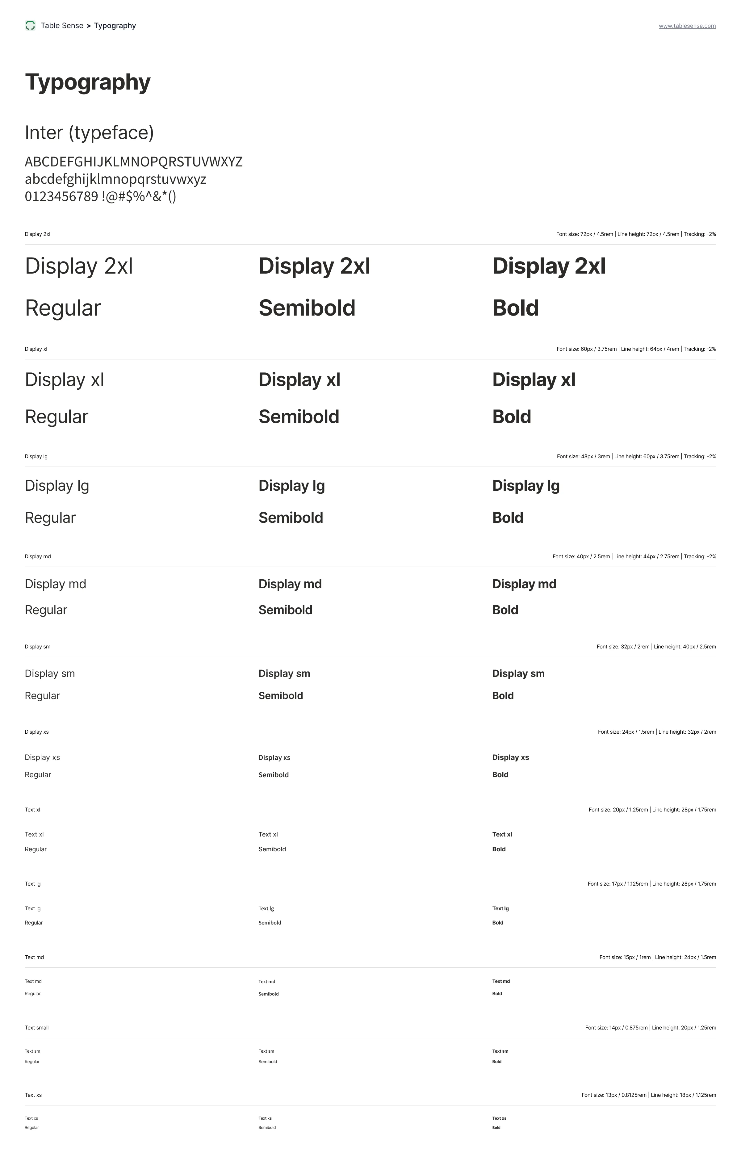
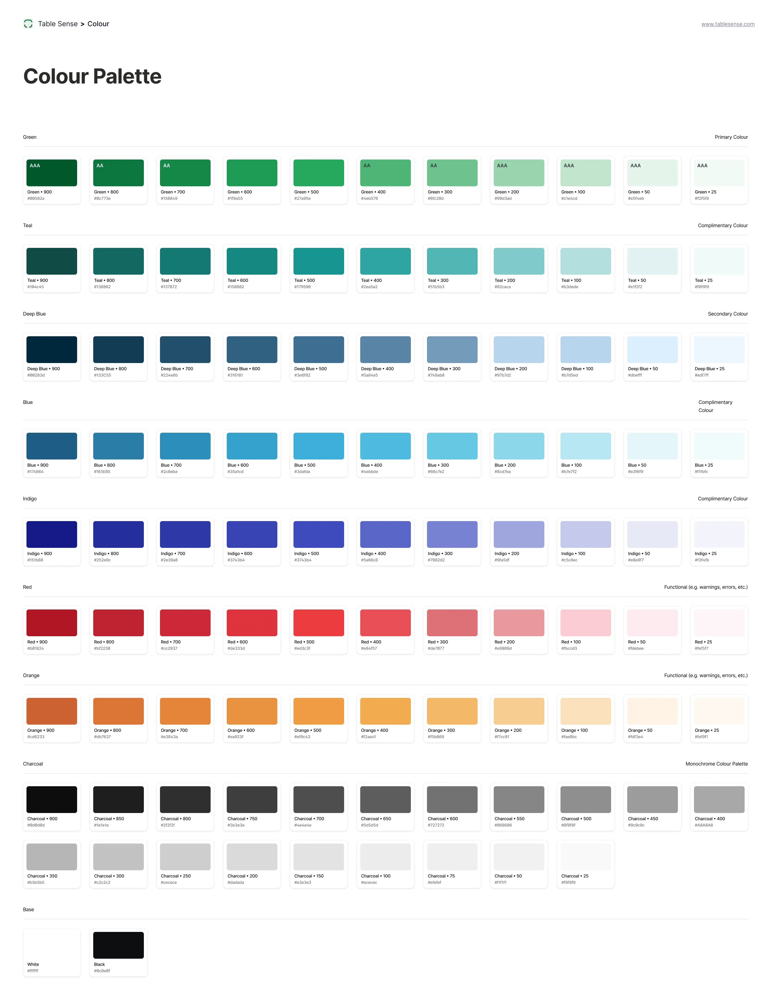
In laying the groundwork for a comprehensive future design system, one of the pivotal steps undertaken was the establishment of diverse Figma component libraries. Recognizing the efficiency they bring to the table, these libraries served as a unified repository of design elements, streamlining the handoff between design and development. By offering the engineering team readily accessible, standardized components, the product development phase was not only expedited but also ensured adherence to design consistency across the platform. This systemic approach reduced ambiguity, minimized potential inconsistencies, and set the stage for a cohesive user experience.

Image displaying a typography sample sheet for 'Source Sans Pro' font. The sheet showcases various font weights and sizes.
A colour palette for 'TableSense' showcasing a range of shades categorised by colour. The palette includes greens, teals, deep blues, blues, indigos, reds, oranges, charcoals, and a white. Each colour is presented in a gradient of shades, with each individual shade labeled with a name and an accessibility rating such as 'AAA' or 'AA'. For example, the greens range from 'Green-100' to 'Green-900', with varying accessibility ratings next to each. The colours are organised in rows by their hue, with annotations for primary, secondary, and complementary colours, as well as functional colours for warnings, errors, etc.

The Solution

Diary

The biggest challenge with the app was about figuring out how to display lots of different information to the user, especially in the diary view, in a way that still felt lightweight and didn’t overwhelm them, even on the smallest screen, all while keeping the UI touch friendly. So, we decided on a few guiding principles anchored in simplicity:

  • A restrained color palette.
  • Intuitive icons that speak for themselves.
  • Customizable diary views.
  • Utilise modality when possible, so the user never looses view of the big picture.

It felt like striking the right balance between giving a lot of info without making it look like a mess. The result is a harmonious UI where merchants could easily zoom in on the data that mattered most to them.

The Diary screen with bookings  for a restaurant on Thursday, July 20, 2023. The interface includes tabs for 'Calendar,' 'Bookings,' and 'Floor Plan.' The selected 'Calendar' tab displays a grid with time slots along the top from 16:00 to 23:00 and table numbers along the side from 'Table 101' to 'Table 111.' Each table has associated bookings, with names and party sizes indicated, such as 'Adam Smith, party of 3' or 'Sandra Gillespie, party of 2.' Certain times like '16:48' are highlighted, suggesting current or upcoming reservations. Icons indicate additional information or actions for each reservation, such as customer contact information or special requests.
Image showing a 'Reports' page from a restaurant booking system covering the week of July 14, 2023, to July 20, 2023. The top section of the interface displays a line graph with the number of bookings per day, highlighting '6 Booked' on Thursday, July 16, 2023. There are filter options for 'Booked,' 'Completed,' 'Cancelled,' and 'No Show.' Below the graph is a table listing individual reservations, with columns for 'Area,' 'Table,' 'Covers,' 'Start,' 'Duration,' and 'Status.' Entries show various bookings across different areas like 'Garden' and 'Restaurant Floor,' with status indicators such as 'Booked,' 'No Show,' and 'Cancelled.' The screen also includes a 'Today,' 'This Week,' 'This Month' filter and an 'Export' option.
Image showing a detailed booking modal window on a restaurant management system for Thursday, July 20, 2023. The modal is labeled 'Booking on Thu, Jul 20' with a 'Confirmed' status. It contains several tabs such as 'Details,' 'Customer,' 'Comms,' and 'Visits.' The 'Details' tab is open, displaying the booking made by 'Sophie Jackson' for 7:00 PM to 8:45 PM, for a party size of 5 people at table 'T102' with a deposit of £20.00 and an option to 'Add Note.' Below are buttons to 'Cancel Booking,' 'Mark as No Show,' and 'Seat Party.' In the background, the main interface shows other bookings and the time slots in a calendar view.

Landing Page

Our insights weren't limited to just the app. Using the findings, we gave the landing page a facelift. Crafted in Framer for its agility, the revamped landing page is not just visually appealing but communicates the product's value proposition with renewed vigor.

Image of a web page for TableSense created in Framer. The page includes a headline about unlocking the power of table booking, followed by a user interface preview of the booking system. Below the header, the page highlights various features like easy multi-platform use, powerful integrations, and a complete view of bookings. It details 'Pro features' for full control of customer bookings, such as an advanced diary, landing page customisation, no-booking fees, and cancellation charges. Additionally, there are sections emphasising revenue growth, efficiency, responsive design, customer trends analysis, and FAQs. The footer encourages taking business to the next level with TableSense and includes buttons for getting started and booking a demo.

Comms

Another essential aspect we tackled was the email communication from TableSense to the customers on behalf of the merchants. Recognizing the significance of the first touchpoint a customer often has with the merchant, it was vital to ensure these emails were not only informative but also left a positive impression. Prioritizing a clear information hierarchy, we designed the emails to be easily digestible, ensuring recipients could quickly grasp essential details like booking confirmation, time, date, and any special instructions. The design aesthetics of these emails was intentionally kept neutral. This neutrality serves a dual purpose: it maintains a professional and clean look while also providing flexibility for individual merchants to subtly incorporate their branding elements, ensuring a cohesive brand experience for their customers.

Image of a sample restaurant booking confirmation email from TableSense. The confirmation displays the restaurant’s name and provides the details of the reservations. The booking confirmation is for Sophie Jackson, booked for 5 people on July 20, 2023, at 7:00 PM at 124 Miller St, Glasgow, and includes buttons for 'View Booking,' 'Get Directions,' and 'Cancel Booking.' The confirmation also includes important dining information about a 15-minute grace period, a request to call if running late, and a note that the table will be held for 30 minutes. The footer contains the TableSense logo, social media icons, a disclaimer about receiving the confirmation.

Post-launch Feedback & Iteration:

While feedback was overwhelmingly positive, the real test of any product lies in how it performs in real-world scenarios. We continue to monitor user feedback and observe merchants as they integrate TableSense into their daily operations. These insights will guide the next phase of TableSense’s development as we continue to improve and evolve th product, ensuring that it remains ahead of the curve and always aligned with merchant needs.

Key Observations:

  • Quick Adoption: The focus on an intuitive design meant that even those not technologically savvy found the system easy to use.
  • Increased Efficiency: Merchants reported significant time savings, better table turnover rates, and reduced no-shows.
  • Enhanced Customer Experience: Restaurants and cafes witnessed a smoother customer experience, with patrons appreciating the transparency and efficiency of the booking system.

Explore more projects

ScottishPower

UTILITY MOBILE APP • B2C

Utilities app offering a more personalised experience to over five million customers.

VIEW PROJECT
High-Fidelity Home and My Account Screens on iPhone Mockup for Utility Energy Mobile App