ScottishPower

2019 · UTILITY MOBILE APP
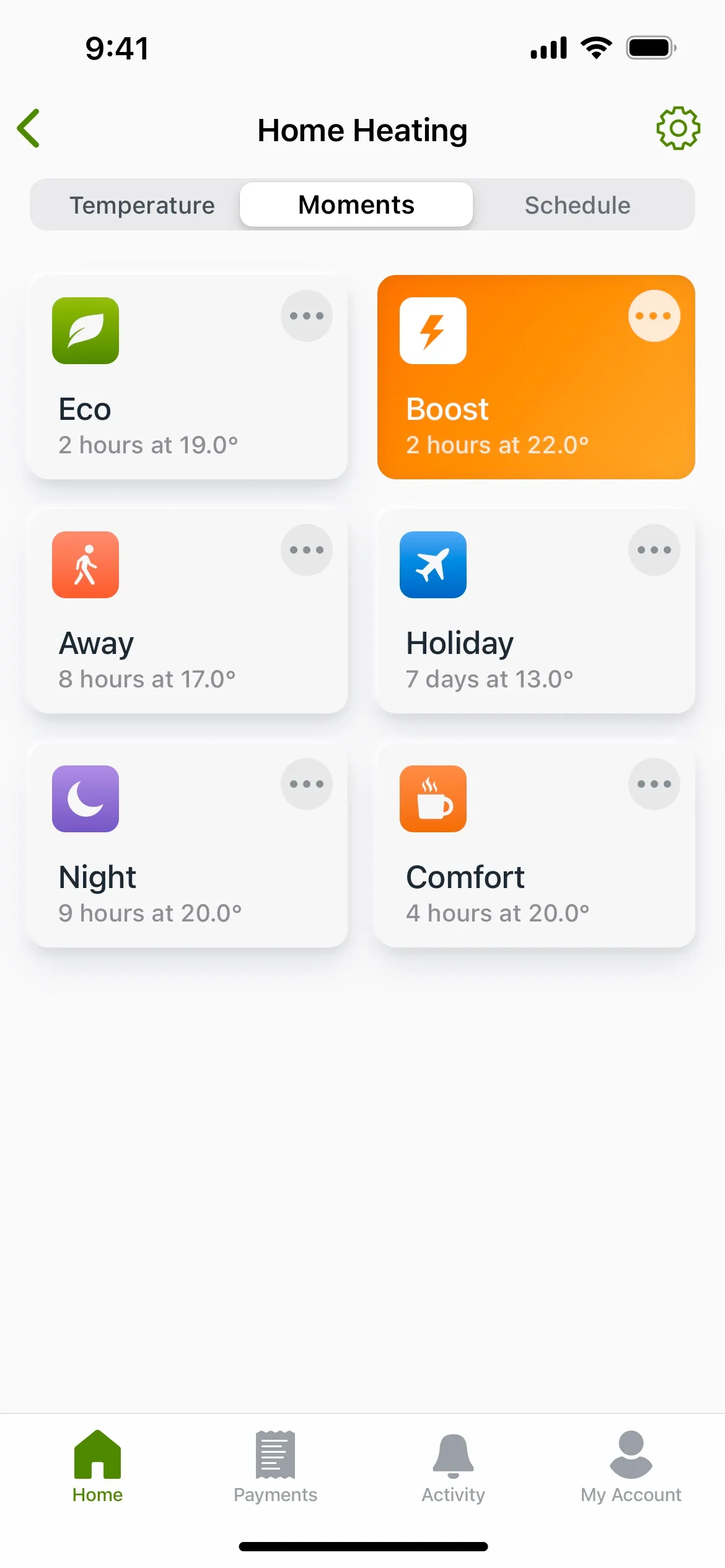
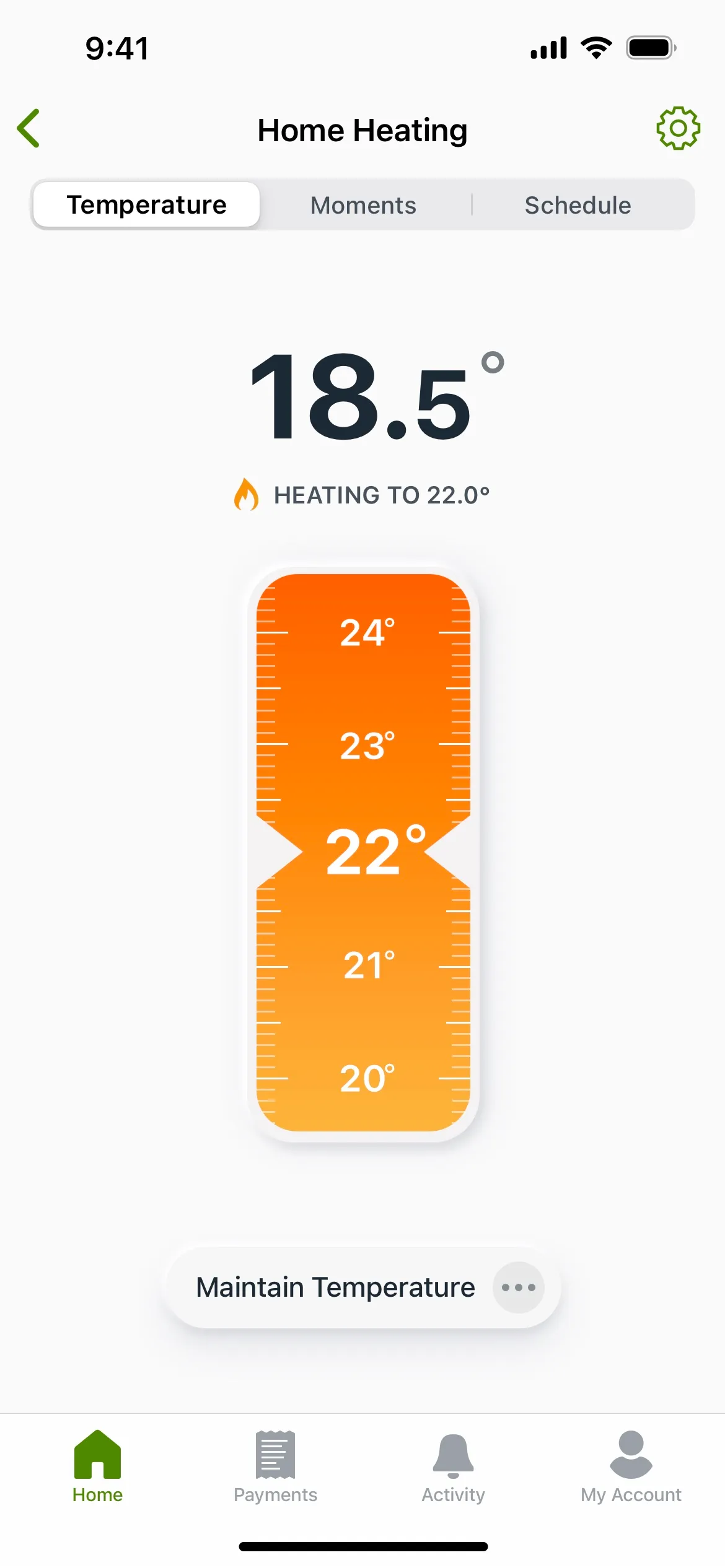
Image displaying a smartphone interface for a home heating control app. The screen shows the current temperature as 18.5 degrees Celsius with an indicator that the heating is set to increase to 22.0 degrees. A vertical slider with temperatures from 20 to 24 degrees allows for adjustment of the target temperature. Below the slider is a 'Maintain Temperature' button. The top of the app has tabs for 'Temperature,' 'Moments,' and 'Schedule,' and the bottom features navigation buttons for 'Home,' 'Payments,' 'Activity,' and 'My Account.' The interface has a clean design with a white background and the temperature slider in shades of orange.
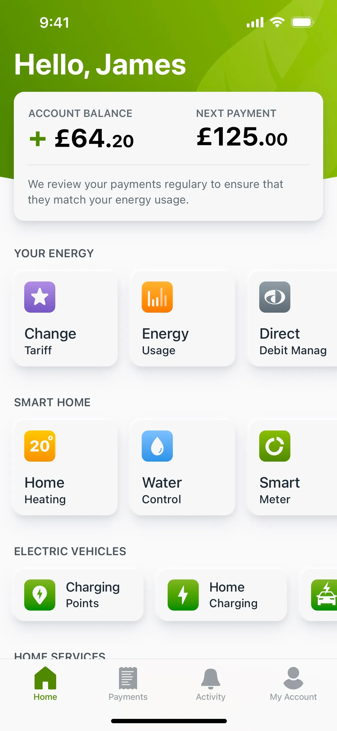
Image of a utilities mobile app's home screen displaying a personalized greeting 'Hello, James' at the top. The screen features an account summary with a positive balance of £64.20 and a 'Next Payment' due of £125.00, along with a note about regular reviews to match payments with energy usage. Below, sections are divided into 'Your Energy' with options like 'Change Tariff', 'Energy Usage', and 'Direct Debit Manag'; 'Smart Home' with controls for 'Home Heating', 'Water Control', and 'Smart Meter'; and 'Electric Vehicles' offering 'Charging Points' and 'Home Charging' options. The interface is clean with icons and labels for each function, and the bottom navigation bar includes 'Home', 'Payments', 'Activity', and 'My Account'.
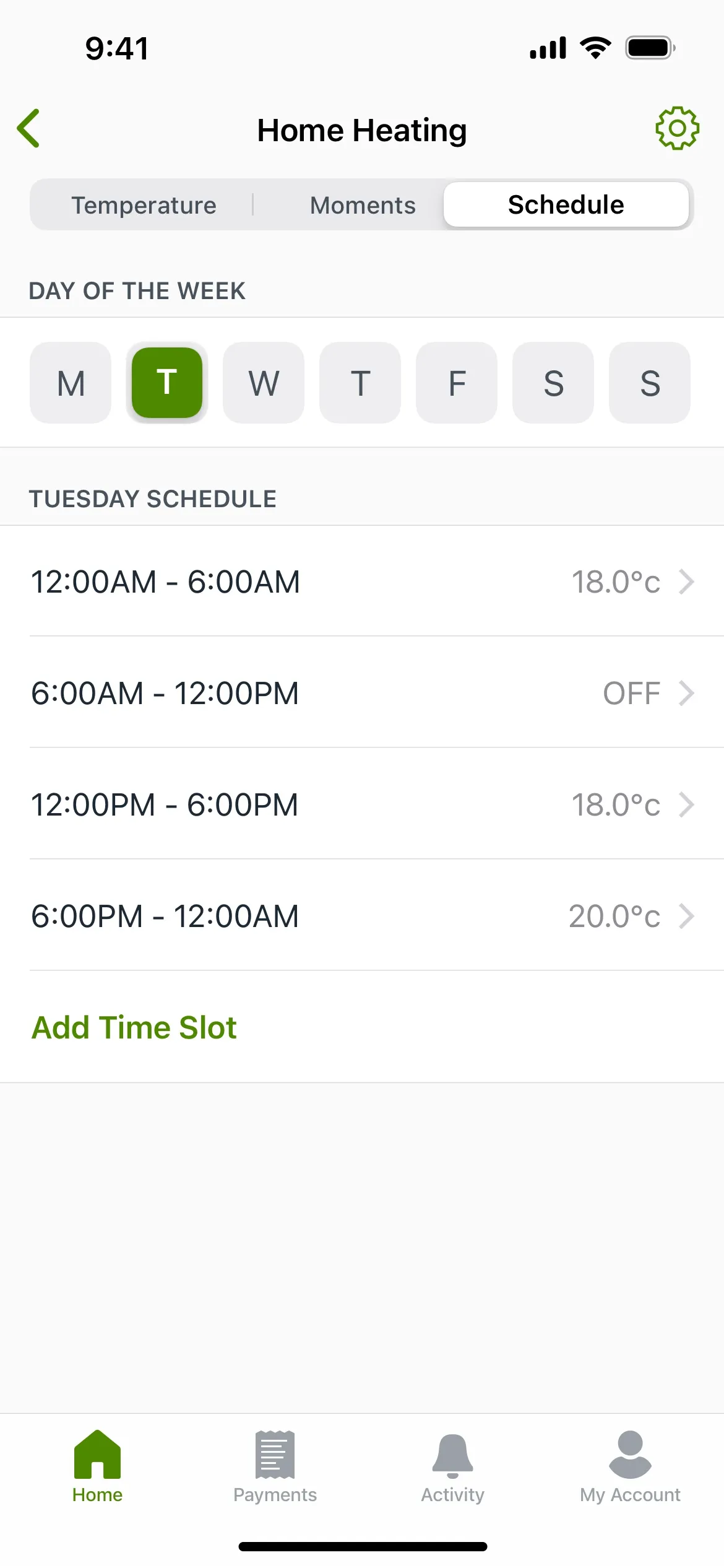
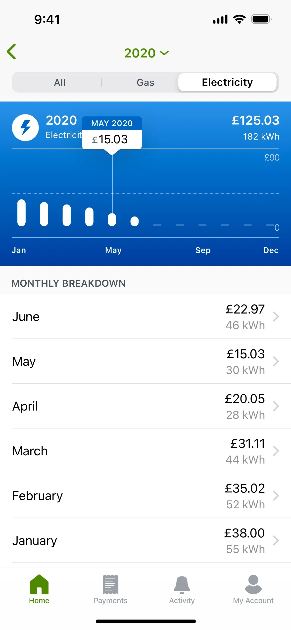
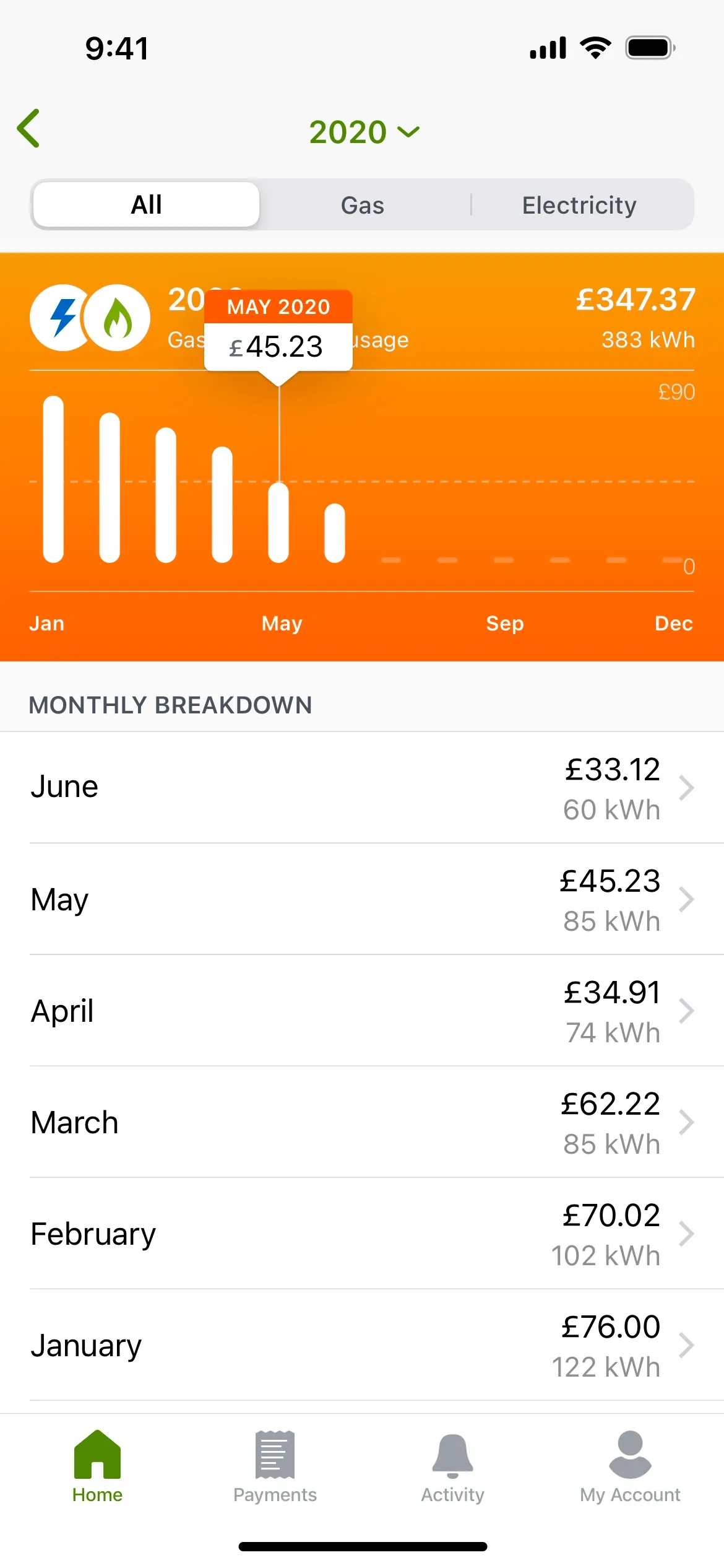
Image showing a smartphone screen with a utility monitoring app. The app header displays the current time as 9:41 and a dropdown menu for the year set to 2020. Below, tabs allow the user to toggle between 'All,' 'Gas,' and 'Electricity' consumption views. The main part of the screen shows a bar graph with 'Gas Usage' for May 2020 at £45.23 and 'Electricity Usage' at £347.37 for 383 kWh. The graph has monthly markers from January to December, with vertical bars indicating usage amounts. Underneath the graph, there's a 'Monthly Breakdown' list detailing costs and kWh for each month, starting with June and ending with January. The bottom navigation bar includes icons for 'Home,' 'Payments,' 'Activity,' and 'My Account.

What's ScottishPower?

ScottishPower is a leader in the wind energy industry and an innovator in the energy sector. It's the first energy company in the UK to produce 100% green electricity. ScottishPower is part of the Iberdrola Group, a global energy company serving around 32 million customers.

CONTEXT
I joined ScottishPower as a Lead UX/UI Designer to play a crucial role in creating a more targeted product strategy and establishing a human-centered design approach within the company. I introduced new tools, practices, and processes to enhance collaboration and efficiency. Additionally, I led the product design efforts for the company's expansion into the USA and Ireland, while also mentoring a team of UX/UI designers, offering them feedback, guidance, and support to help them advance in their design careers.
MY ROLE
Product Strategy
Interaction Design
Visual Design
User Flows
Prototyping
User Testing
Mentoring
Design Systems
TOOLKIT
Sketch app logo Marvel app Logo Abstract app logo
PLATFORMS
Apple iOS Logo Android OS Logo

Goal

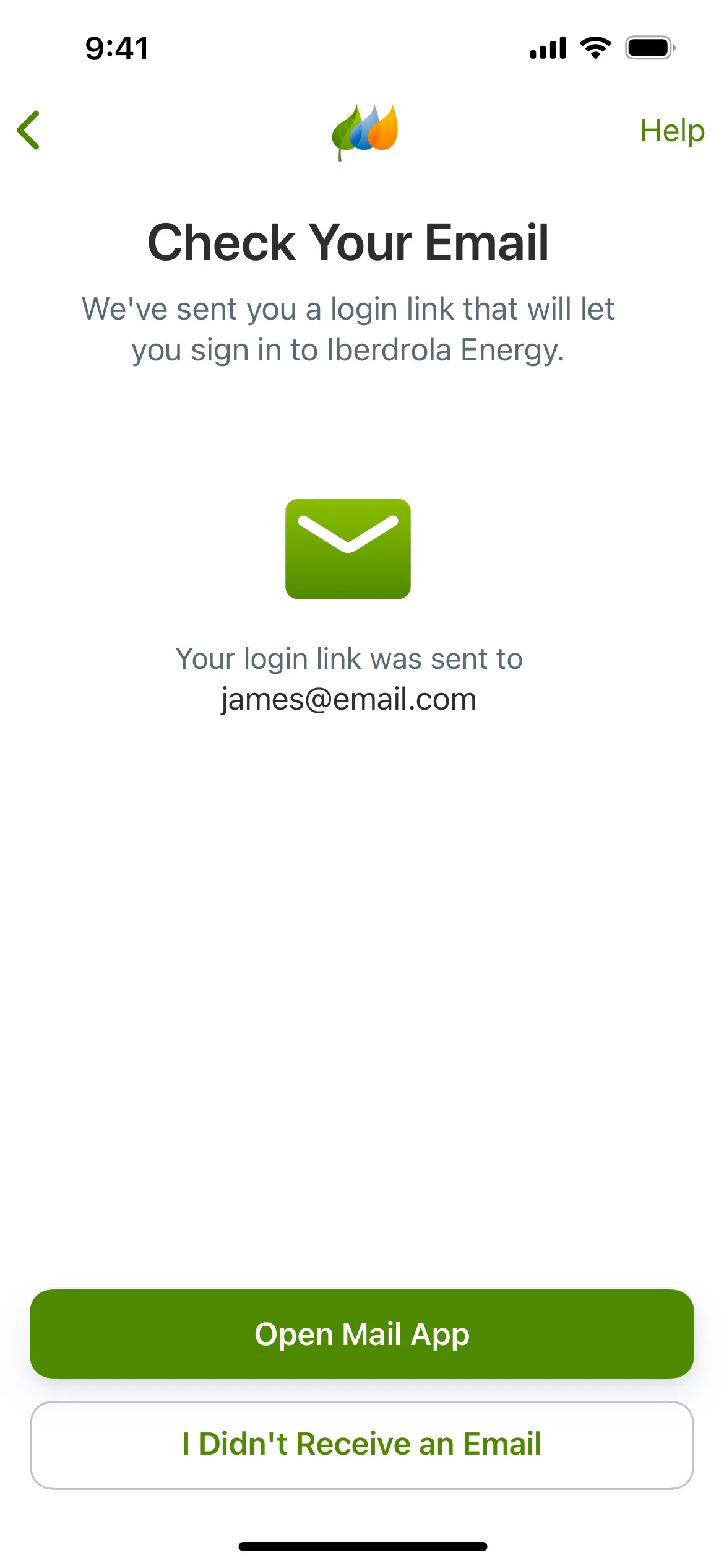
The goal of this project was to radically redesign the existing ScottishPower app and deliver a smooth, more contextual user experience, to improve the visual style and introduce new areas of the business such as home services, smart devices and electric vehicles.
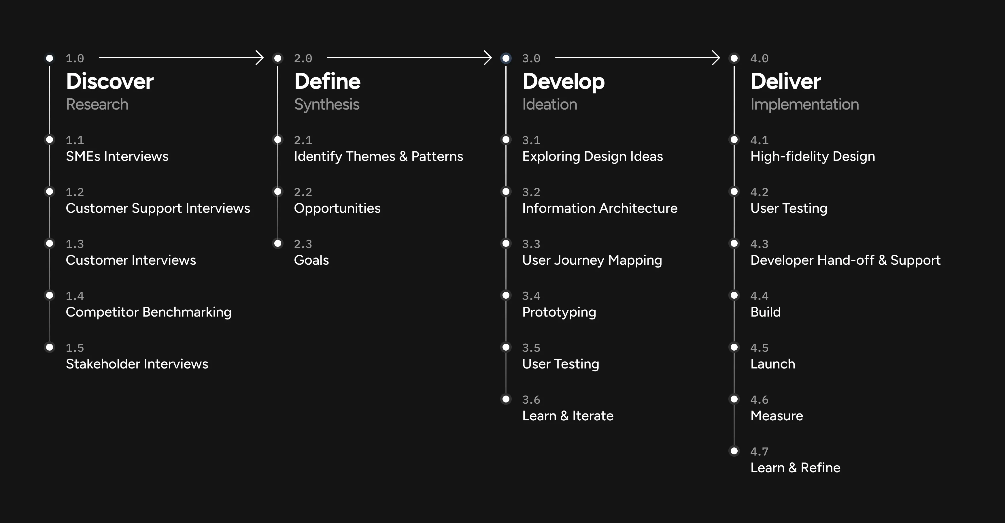
The image is a graphic representation of a four-stage product development process with various steps listed under each stage. Stage 1.0 "Discover" includes research activities like SMEs Interviews, Customer Support Interviews, Customer Interviews, Competitor Benchmarking, and Stakeholder Interviews. Stage 2.0 "Define" involves synthesizing this information to Identify Themes & Patterns, pinpoint Opportunities, and set Goals. Stage 3.0 "Develop" is about Ideation with steps such as Exploring Design Ideas, Information Architecture, User Journey Mapping, Prototyping, User Testing, and Learn & Iterate. The final stage 4.0 "Deliver" covers Implementation with High-fidelity Design, User Testing, Developer Hand-off & Support, Build, Launch, Measure, and Learn & Refine. Each stage is connected with arrows indicating the flow of the process.
0.1 –
The Process
IMAGE

Approach

Throughout the project, I collaborated with stakeholders, product owners and business analysts to gather project requirements, collect feedback and conduct iterative user testing on wireframes, interactive prototypes, and visual designs. I ensured that the new app fulfils customer needs, follows the technical and business requirements and complies with the regulatory and legal standards.

I worked closely with the engineering team, providing support during every stage of the implementation process. I helped smooth out any unforeseen issues that might have arisen, resulting in a successful and smooth delivery of the final product.
0.2 –
Login flow
IMAGE

The Solution

Highlights

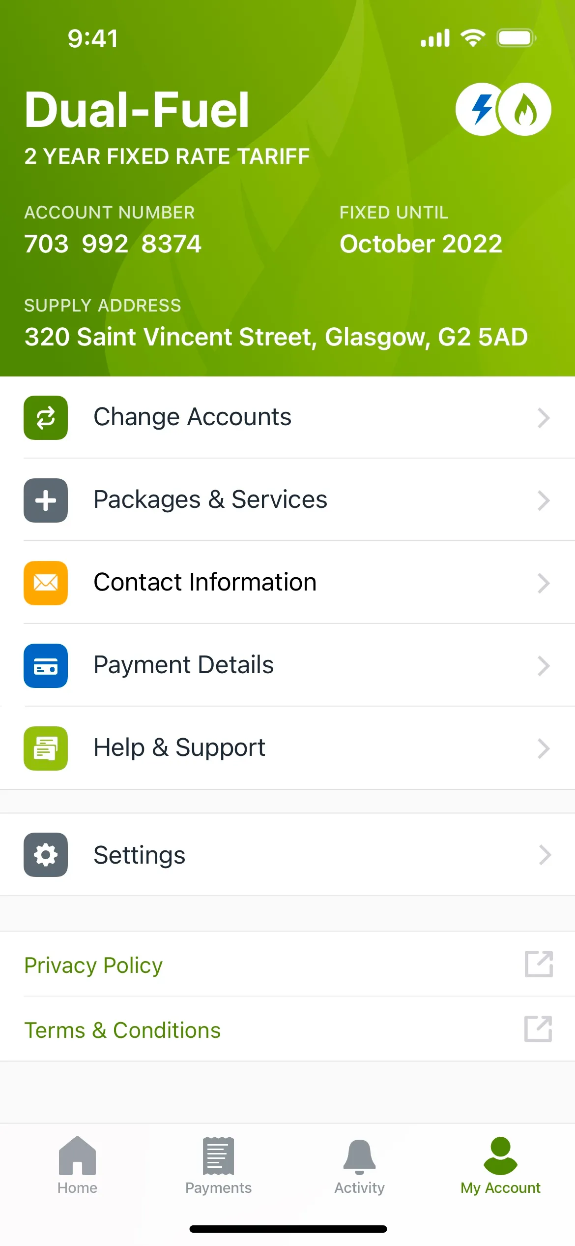
The new home screen offers a personalised experience to all 5 million ScottishPower customers. Thanks to its scalable tile design, it can easily adjust to new business needs and requirements based on dynamic rules and customer types.

Each tile on the home screen represents a micro-app within the main ScottishPower app. In addition, tiles could turn into widgets and present more contextual information to users at a glance on the app home screen.

Image of a utilities mobile app's home screen displaying a personalized greeting 'Hello, James' at the top. The screen features an account summary with a positive balance of £64.20 and a 'Next Payment' due of £125.00, along with a note about regular reviews to match payments with energy usage. Below, sections are divided into 'Your Energy' with options like 'Change Tariff', 'Energy Usage', and 'Direct Debit Manag'; 'Smart Home' with controls for 'Home Heating', 'Water Control', and 'Smart Meter'; and 'Electric Vehicles' offering 'Charging Points' and 'Home Charging' options. The interface is clean with icons and labels for each function, and the bottom navigation bar includes 'Home', 'Payments', 'Activity', and 'My Account'.
0.3 –
Home & My Account screens
IMAGE
Image displaying a smartphone interface for a home heating control app. The screen shows the current temperature as 18.5 degrees Celsius with an indicator that the heating is set to increase to 22.0 degrees. A vertical slider with temperatures from 20 to 24 degrees allows for adjustment of the target temperature. Below the slider is a 'Maintain Temperature' button. The top of the app has tabs for 'Temperature,' 'Moments,' and 'Schedule,' and the bottom features navigation buttons for 'Home,' 'Payments,' 'Activity,' and 'My Account.' The interface has a clean design with a white background and the temperature slider in shades of orange.
0.4 –
Smart Thermostat UI
IMAGE
0.5 –
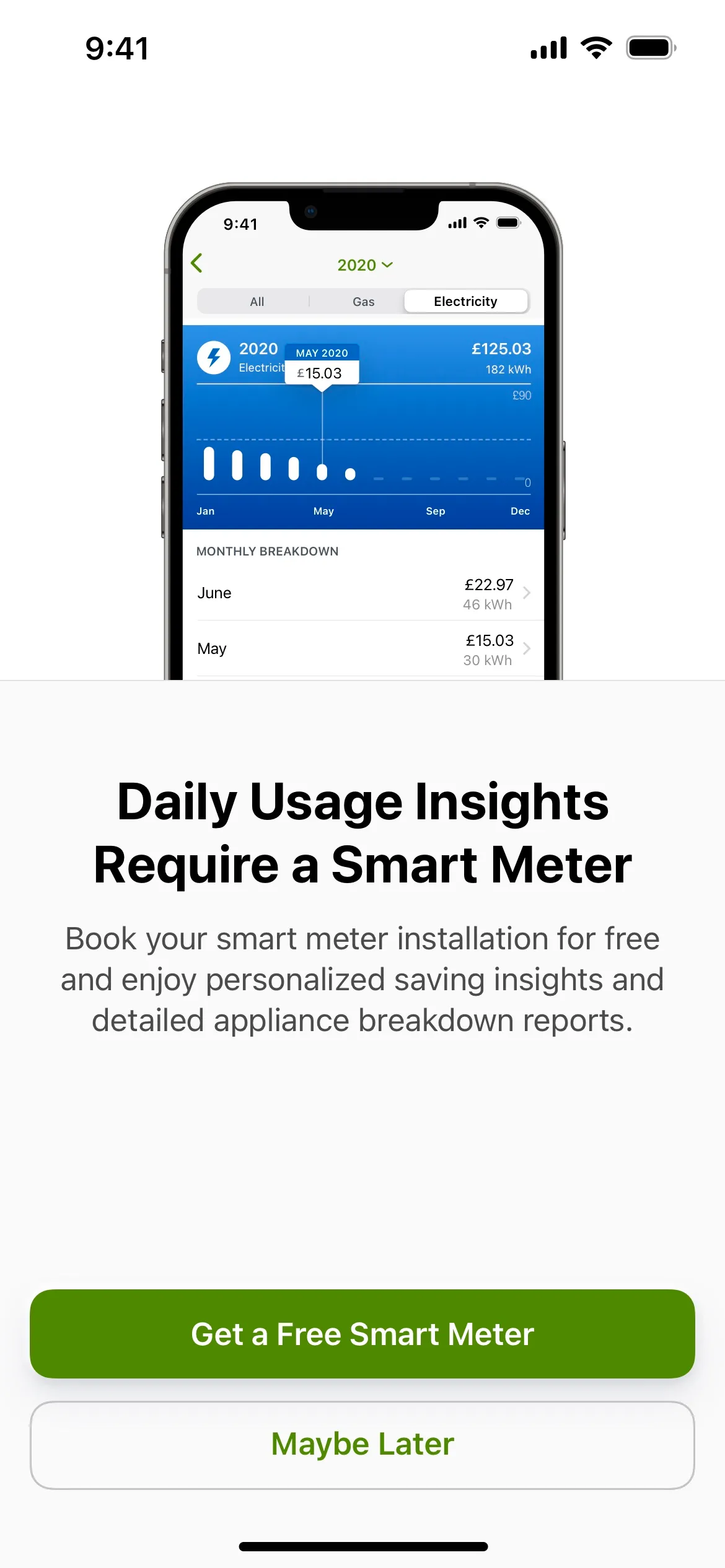
Energy usage and Smart Meter upsell
IMAGE
0.6 –
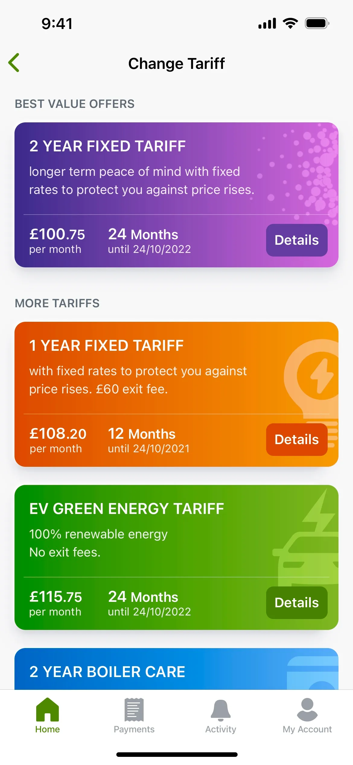
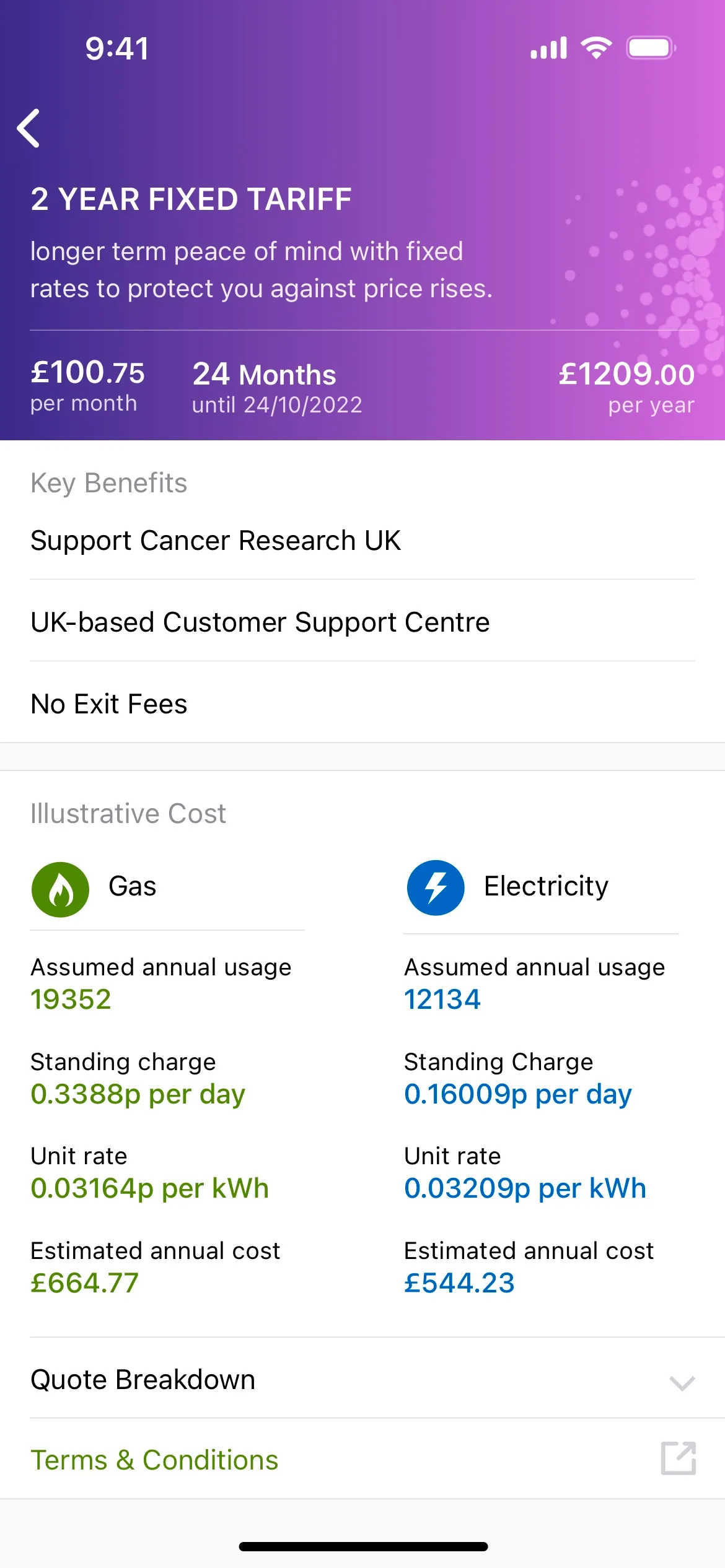
Change energy tariffs via the app
IMAGE

Results

+24%
increase in sales of home services and smart home devices.
+19%
increase in Smart Meter installation bookings via the mobile app.
21%
drop in customer support calls shortly after the release of the new mobile app.
+16-points
increase in the Net Promoter Score (NPS) compared to the previous version.

Related case studies

Iberdrola Global

DESIGN SYSTEM

Iberdrola's first design system to boost efficiency and improve the visual consistency across products.

VIEW CASE STUDY