Boundary




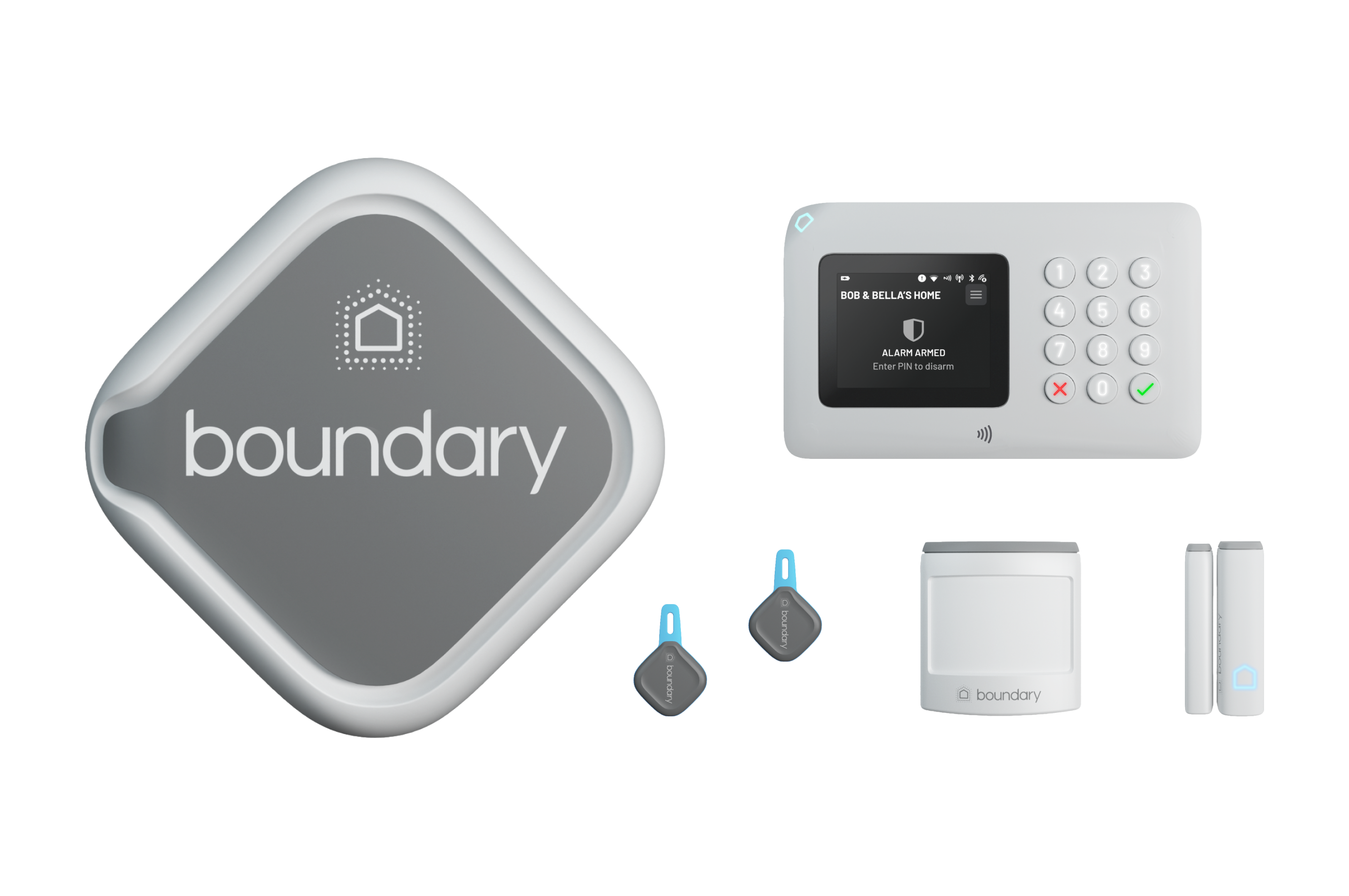
Boundary is a wireless smart home alarm system (B2C SaaS plus a box), that offers subscription plans with additional features, such as police response and a mobile app for control & self-monitoring of the system.
In the era of smart home devices, homeowners find traditional home security systems lacking in several key aspects. There's a rising demand for alarm systems that can be easily installed and set up via an app, offering not only smart features but also immediate police response in emergencies. However, many solutions currently available are complex to set up and navigate, hindering their efficiency.
To kickstart the project, we embarked on an in-depth competitor benchmarking phase. We thoroughly analysed a variety of smart home security apps on the market, studying their design, functionality, ease of use, and customer reviews. This gave us a broad understanding of the industry standards, common pain points, and areas where we could innovate and differentiate ourselves. We compiled a detailed feature comparison matrix and identified opportunities for improvement, particularly in areas where users found the current market offerings lacking.
Next, we interviewed potential customers, our focus being homeowners in the 30-55+ age group. We conducted one-on-one interviews, which allowed us to delve into their needs, expectations, and experiences with current home security systems. We explored their desires for a seamless, easy-to-use solution, the value they placed on immediate police response, and their interest in managing the system through a mobile app. These conversations gave us a clear picture of our target users' needs and pain points, and influenced the development of our user personas and the overall product strategy.
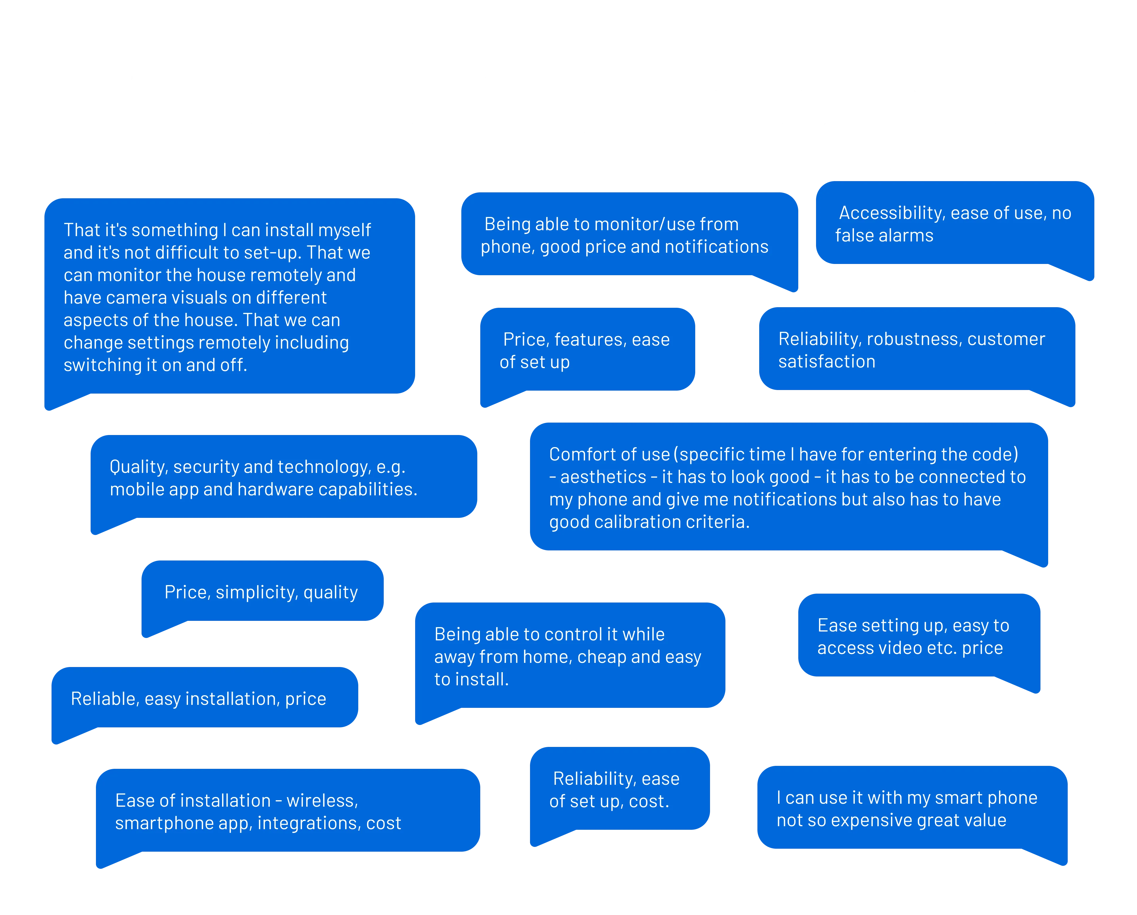
The insights from the discovery stage were crucial in guiding the project direction. They not only illuminated the landscape of the smart home security app market but also clarified the needs and expectations of our target audience. As a result, the findings played an instrumental role in defining our four primary goals for this project:
We've gathered a cross-functional team, including stakeholders, engeneers, and product managers and embarked on a series of collaborative sessions, ensuring a diverse set of perspectives were at play. We employed techniques like mind mapping, sketching, and scenario building to visualise potential features and user journeys. During these sessions we challenged assumptions and built upon each other's ideas. The outcome was a multitude of innovative concepts, each tailored to address user needs and pain points, ensuring the app would offer features that deliver real value.
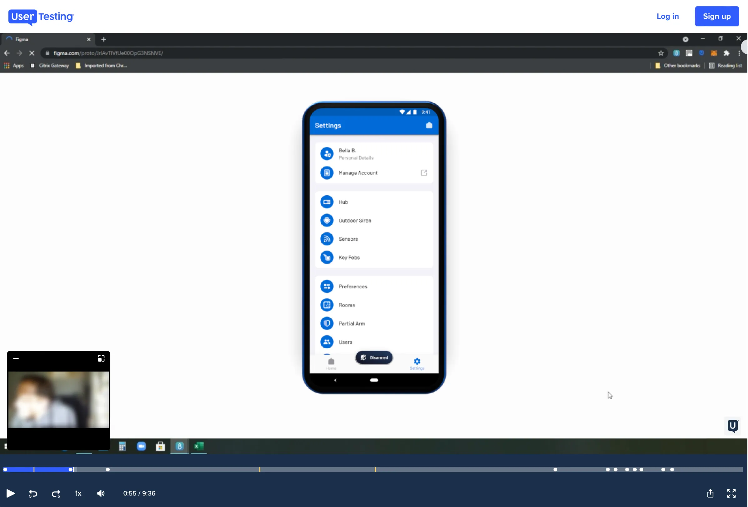
Next, I used Figma to create detailed interactive prototypes of the app. These prototypes served as a visual and functional representation, allowing stakeholders to grasp the app's flow, interactivity and design direction. Once I've created the initial designs, we moved to test the concepts. Partnering with UserTesting.com, we shared the prototypes with potential customers, gauging their reactions, understanding their navigational choices, and collecting invaluable feedback. These sessions highlighted areas of friction, validated our design decisions, and most importantly, ensured our final product would be meticulously refined based on actual user interactions and expectations.
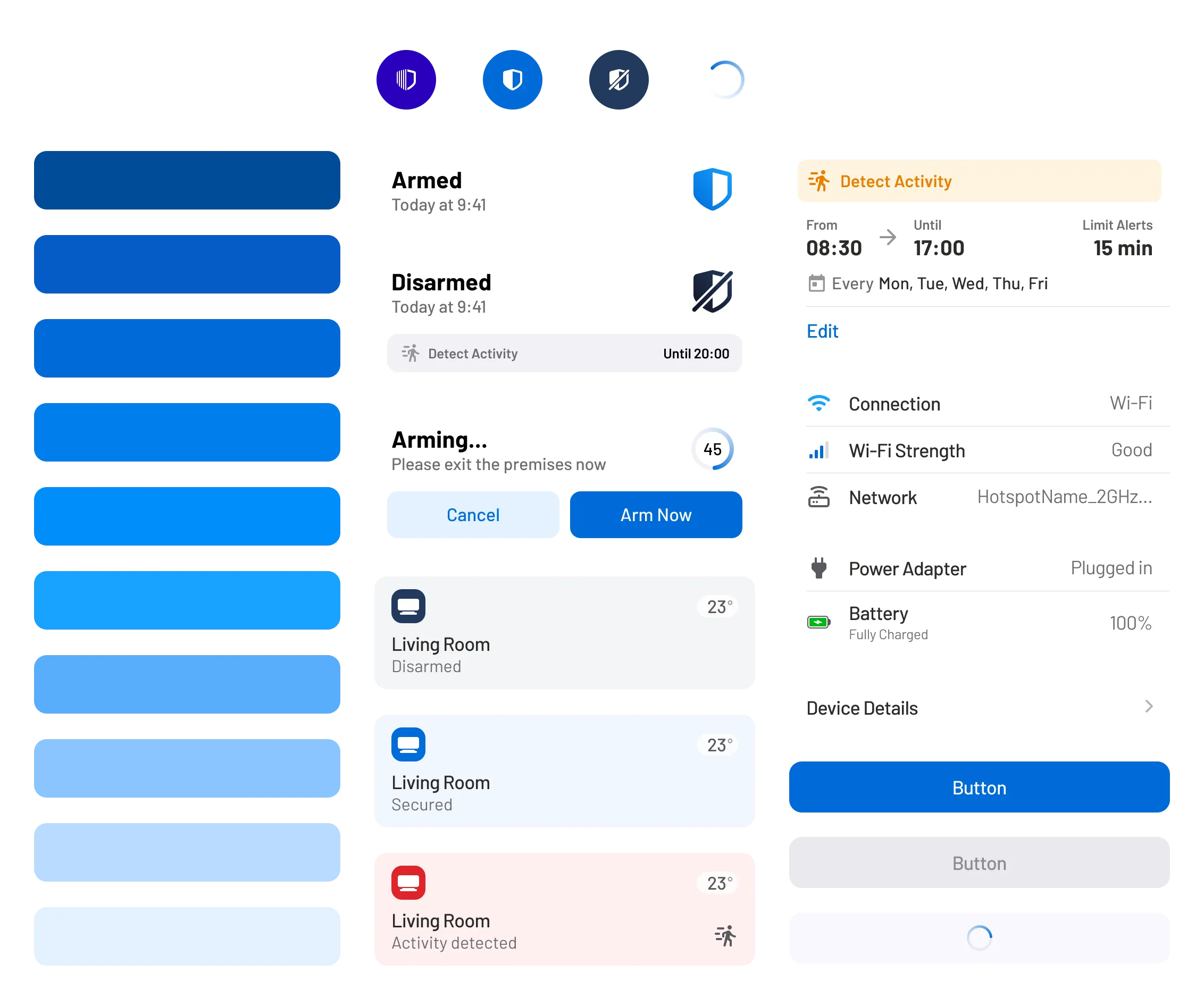
The first step in crafting the look and feel of the app was to establish a diverse Figma component library for both iOS and Android. These libraries were the foundation of what would eventually become the company's design system and simplified the shift from design to development by offering standardised elements. This accelerated product development and reinforced design uniformity. Throughout the process, I provided consistent support to the engineering team, fostering a unified user experience.
The final round of testing was conducted using the actual hardware alongside the app, wherein we provided a group of potential customers with access to both for a month. They were tasked with setting up the system themselves and use its features. The feedback gathered from this month-long, hands-on testing experience led us to make several minor adjustments and enhancements to the app before its official release, thereby reinforcing our confidence in its performance and design.
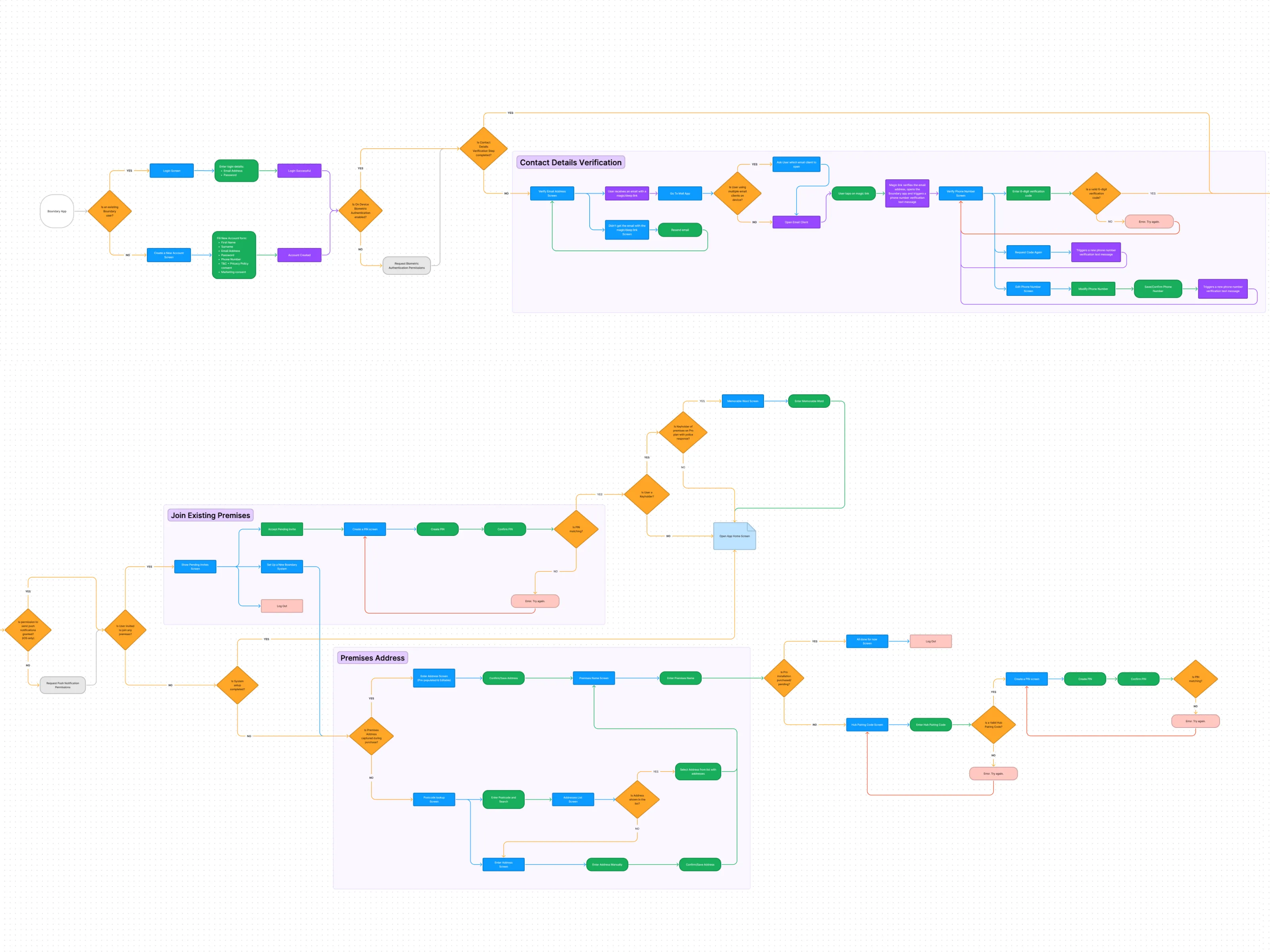
One of the most crucial pieces of work was the development of the app's onboarding journey and setup. This initial experience is the customer's first touchpoint with their new alarm system, and we understood the significance of making a strong, positive first impression. It's a crucial step in building trust and confidence in the product.
There were numerous potential paths for the onboarding journey, depending on factors such as the type of system, installation method, and purchase channel. I meticulously designed each of these paths, both happy and unhappy, to ensure a seamless experience regardless of the user's specific situation.
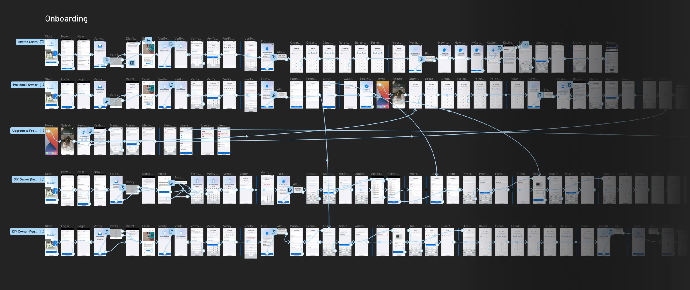
We made it a priority to ensure that every user, regardless of their level of technical expertise, would feel confident and capable during the setup process, laying the foundation for a positive ongoing relationship with their alarm system. We closely adhered to established standards within the smart home IoT industry, which are already familiar to many of our users. This approach helped us create a smoother, more straightforward installation process, reducing the potential for user frustration or errors.

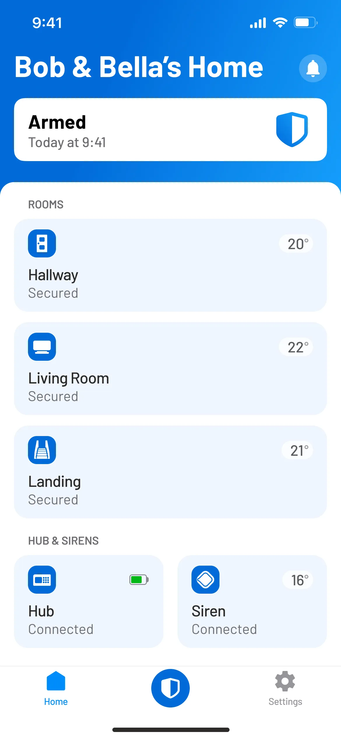
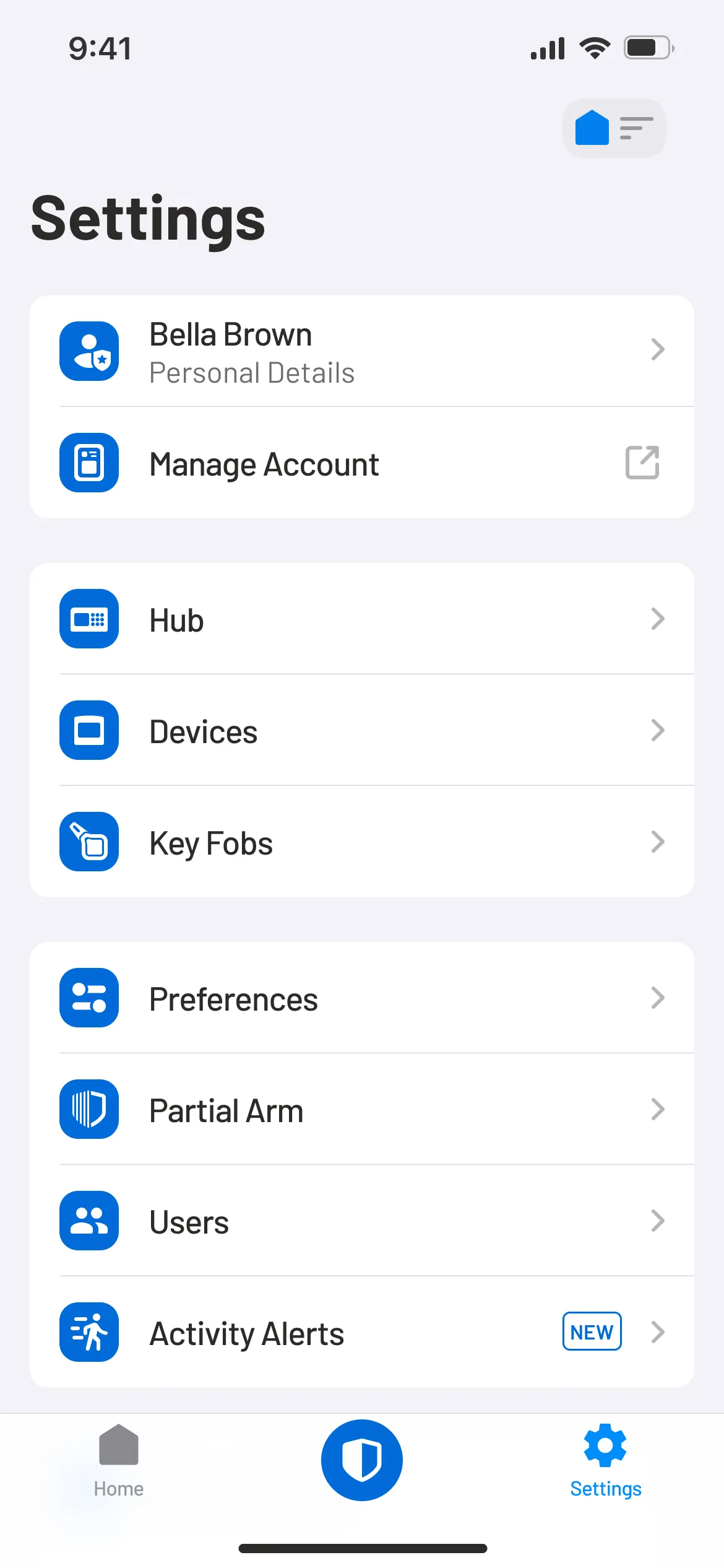
The top of the app's Home screen features a tile that displays the current status of the security system, making it easy to understand whether the system is armed, part-armed, triggered, disarmed or offline. All monitored rooms in the house are listed directly underneath, allowing customers to see if there is any activity in the rooms or if a sensor in a particular room needs attention.

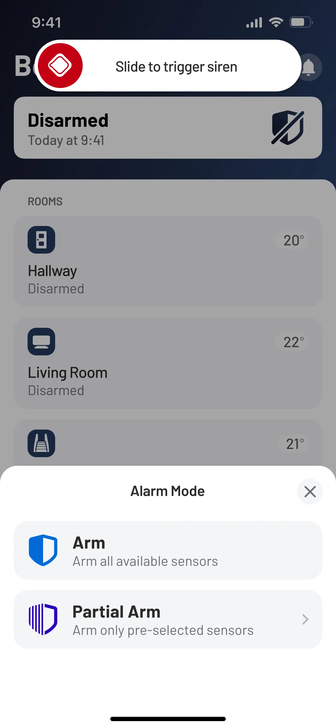
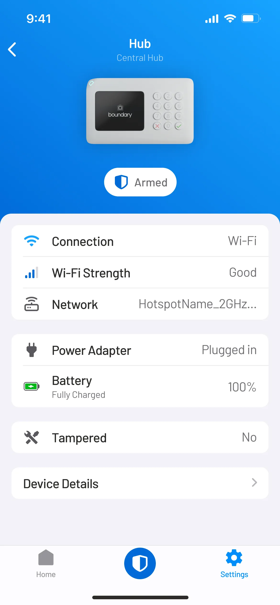
The app's tab bar provides a quick access to different sections of the app, including the Home screen and Settings, and the ability to quickly change the alarm mode of the system from anywhere within the app.


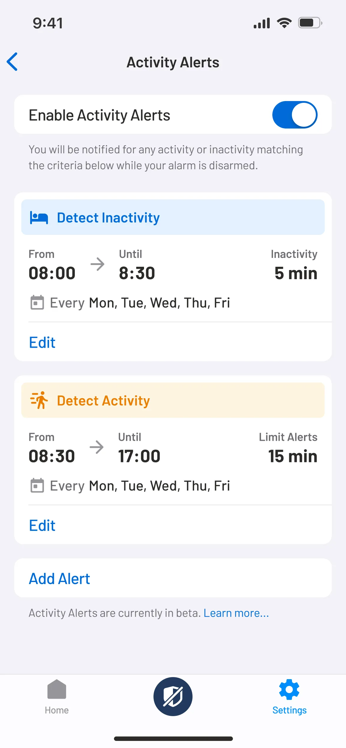
Activity Alerts is a unique feature that allows customers to create personal alerts and get notified of any activity or inactivity detected in their home while the alarm system is disarmed. For example, the app could let you know if an elderly loved one is not following their normal routine and might need help. If someone is sleepwalking or not getting up in time for school.


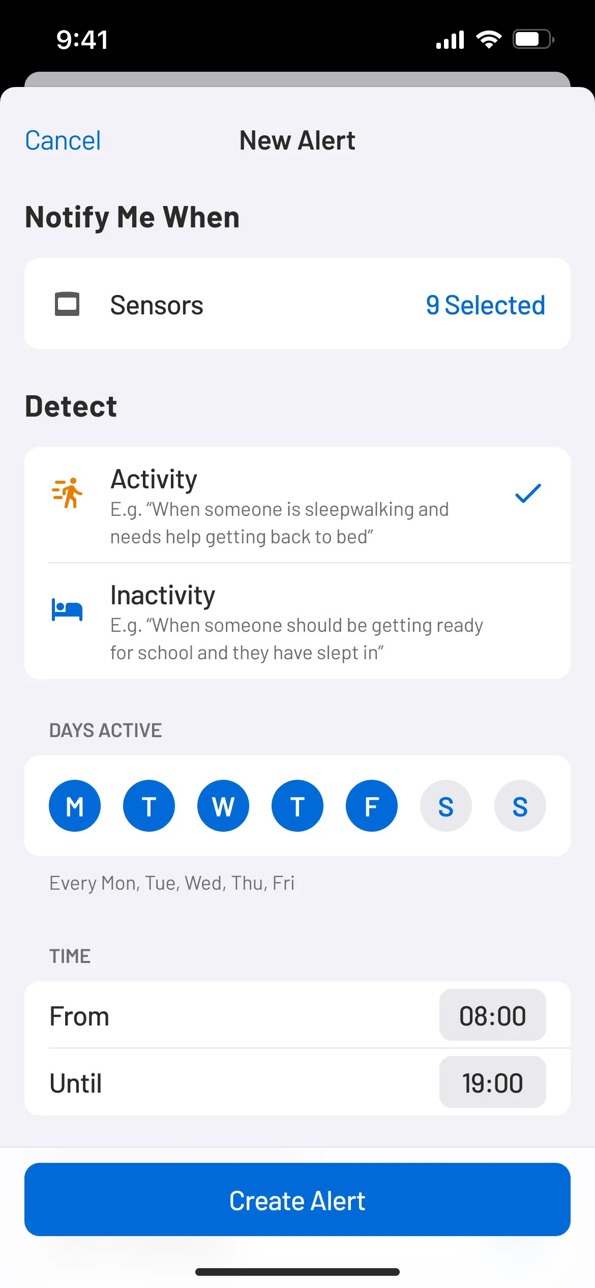

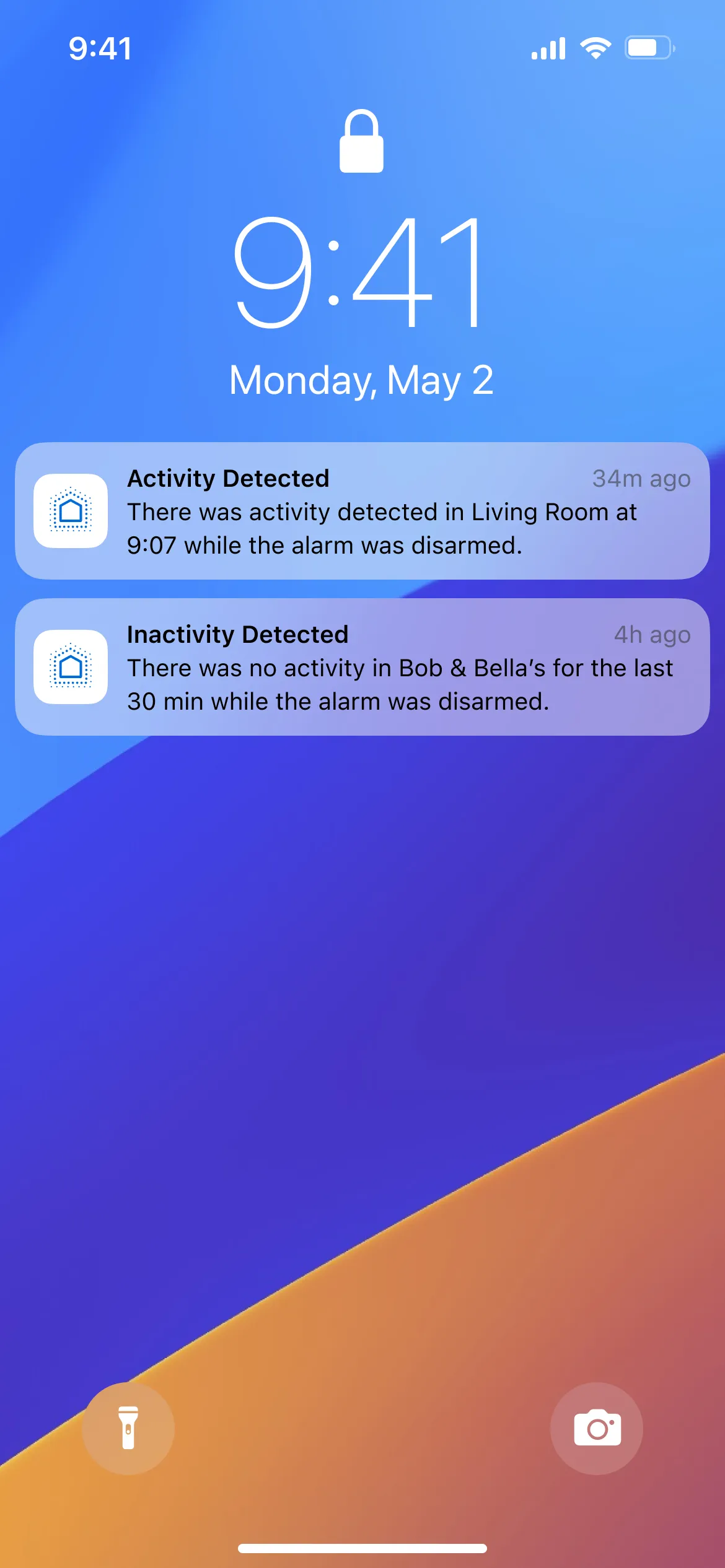

We made use of the vast amounts of data gathered by contact and motion sensors in a controlled and secure way and translated this data into useful insights. The feature was released a couple of months after the initial launch of the app and helped us deliver even more value to Boundary's customers, significantly increasing the number of Daily Active Users (DAU).
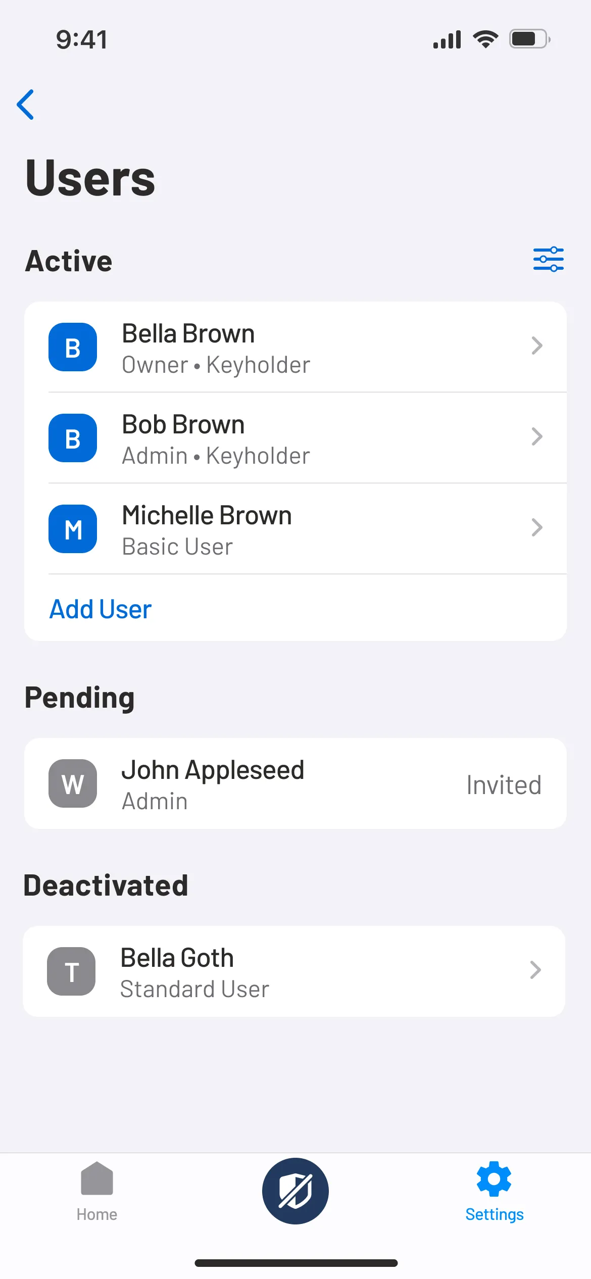
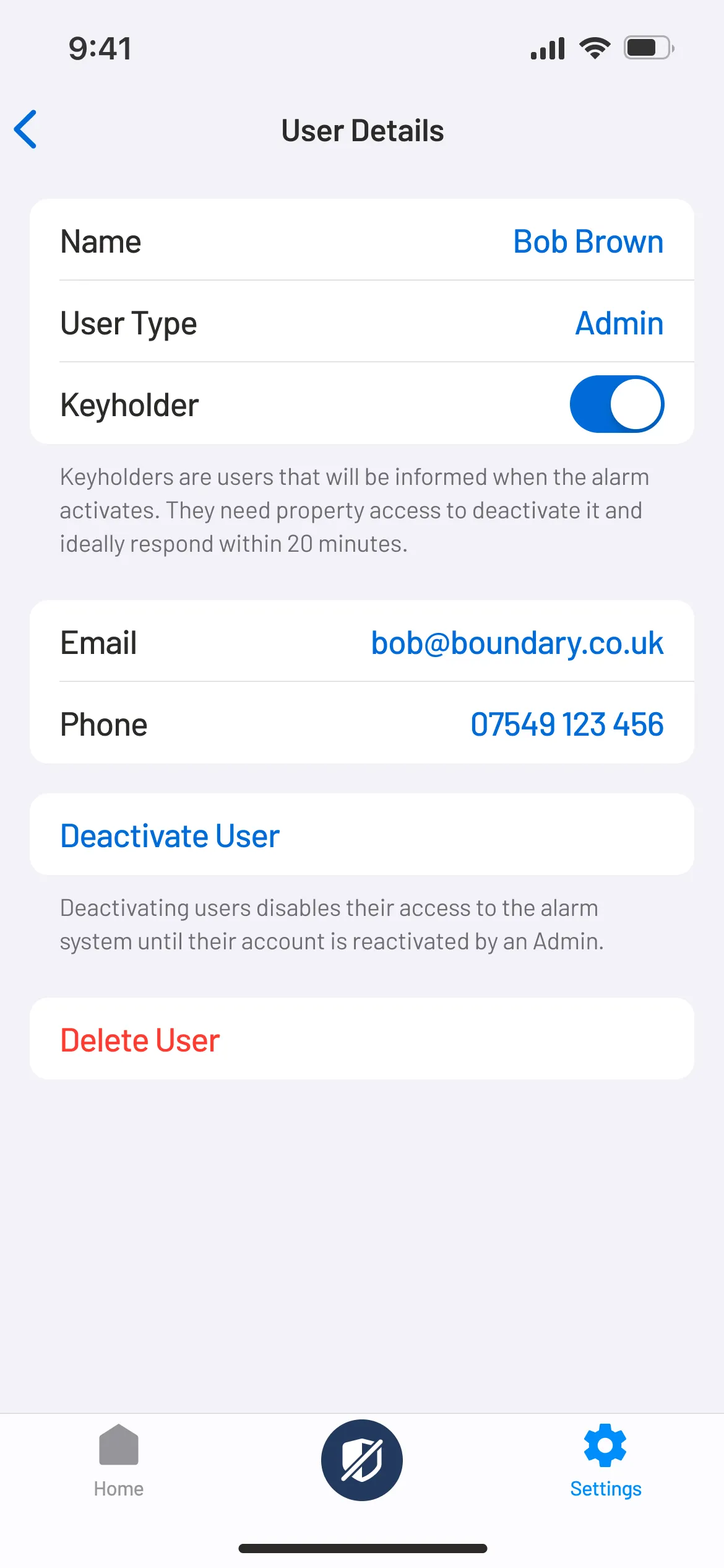
The app gives customers complete control over their security system with advanced user management features, such as the ability to invite others to their security system and set the desired level of access for each person, eliminating the need to share accounts and PINs.


From the moment the app launched, we initiated the tracking of our Net Promoter Score (NPS) to gauge customer satisfaction and loyalty. Through iterative feature releases and updates, we continued to steadily improve our initial NPS score. The app was met with enthusiasm from customers, evident from the commendable 4.4-star rating on the App Store and the overwhelmingly positive reviews on both the Google Play Store and the App Store. We continued working on various objectives and key results set by the leadership team to further enhance the app and meet business goals.